ATSC 113 Weather for Sailing, Flying & Snow Sports
Interpreting winds from weather maps
Learning goal 5b. Interpret winds from pressure-level weather maps in terms of ski safety
Pressure-level maps
If you're going skiing, you'll want to look at weather for the elevations at which you'll be skiing (recall Learning Goal 6n where we related pressure levels to mountain heights). Let's say you're off to Grouse Mountain in the North Shore Mountains just north of Vancouver. A good pressure-level map for Grouse would be one plotted for 85.0 kPa (~1500 m) because that's a commonly-plotted pressure level that's relatively close to the resort elevation (Grouse Mountain's peak elevation is 1250 m). At Whistler, 85.0 kPa is about mid mountain (base 653 m, top 2284 m).
A pressure level, or surface, is roughly horizontal in the atmophere. Meteorologists use pressure as a vertical coordinate, much like we would use metres. The main difference is that as you go up in the atmosphere, elevation (m) increases, but pressure (kPa) decreases. Being able to see what's going on at different vertical levels in the atmosphere is very useful for mountain weather forecasting. Let's visualize what pressure levels look like in the atmosphere:
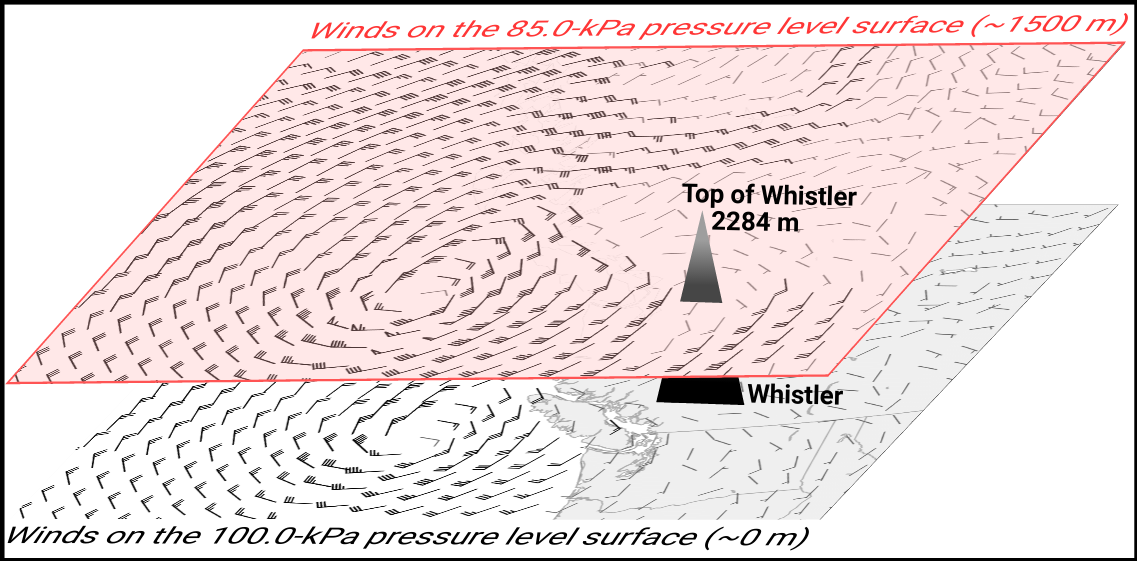
Fig. 5b.1 - Winds displayed in barbs (explained later in this section) on two pressure-level surfaces. 100.0 kPa is roughly sea level, and 85.0 kPa is about 1500 m above sea level. You can see that the 85.0-kPa pressure level intersects Whistler at mid mountain. (Credit: West.)
Pressure-level maps are often animated loops, moving forward through time showing the future forecasted weather. The first map starts with an analysis map at the time the Numerical Weather Prediction (NWP) computer model was started. As the animation moves forward, the maps show the evolution of the weather into the future; these are forecast maps. Pressure-level maps show different variables, typically overlaying more than one on the same map. We'll add variables one at a time.
A side note about pressure-level weather maps:
NWP model output is typically available at all pressure levels everywhere on earth. In some areas, like mountainous regions, some of these pressure levels are below ground. For example, an NWP model will unrealistically provide a value for air temperature at 85.0 kPa (~1500 m above sea level) at the location of Mount Robson's peak, for example, where the actual ground surface is higher up at 3954 m above sea level, or ~62.5 kPa (see Learning Goal 6n, Fig. 6n.2). With this in mind, it's best to use pressure-level maps that are at or above your elevation of concern.
Interpreting Wind
Here's a pressure-level map with wind plotted on it:
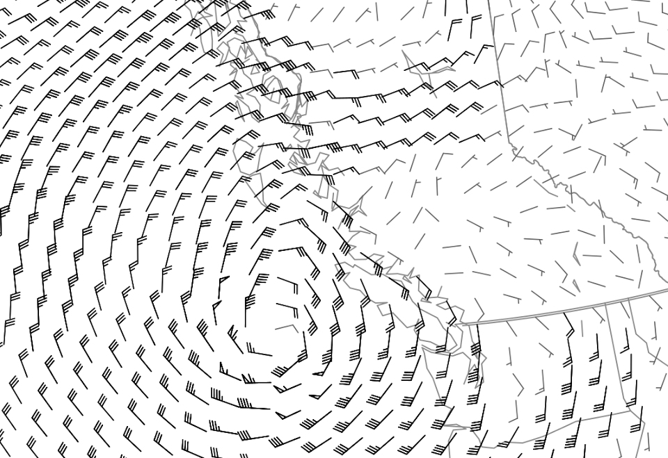
Fig. 5b.2 - A pressure-level map covering the northeast Pacific Ocean, BC, Washington, and some of Alberta. Wind is displayed with wind barbs (explained below). (Credit: West.)
Wind is typically displayed on weather maps using wind barbs.
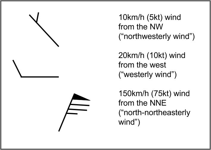
Fig. 5b.3 - Examples of wind barbs and their
meanings. (Credit: West.) . The top example shows a "half
barb" speed. The middle example shows a "full barb" speed.
The bottom example includes a pennant (triangular flag) and some full
barbs and a half barb.
One end of a wind barb is a plain line - - it is like the shaft of an arrow. The other end has shorter barbs extending off it (Fig. 5b.3), like feathers attached to the arrow shaft. The orientation of the entire wind barb shaft tells you the wind direction. The plain end of the shaft with no shorter barbs points to the direction that the wind is going to. Take a moment to go through the examples in Fig. 5b.3 above and make sure the directions make sense to you.
The shorter barbs (feathers) protruding from the other end indicate wind speed. These come in two sizes: the half barbs (the shorter ones) are 10 km/h (or 5 kts) each, while the full barbs (the longer ones) are 20 km/h (or 10 kts) each. They are additive. For example, if there were two full barbs and one half barb, the wind speed would be (20+20+10=) 50 km/h. When triangles or flags appear, beware, they represent 100 km/h each (three flags would mean 300 km/h winds!). Suffice it to say, if you see a flag on a given pressure-level map, you do not want to be outside skiing at that elevation. Try adding up the barbs and flags in Fig. 5b.3 to see if you get the correct speed. In the pressure-level wind plot (Fig. 5b.2) do you see areas of hazardously highwind speeds?
The wind speeds plotted on pressure-level maps are best thought of as estimates of wind speeds in the "free atmosphere" at that elevation. This excludes the effects of friction from the surface which acts to slow down the wind speed. In later modules we will get into more detail on how to relate pressure-level winds from NWP model output into real-world wind speeds in different mountain locations.
Wind speed units conversion tips
You can do rough conversions between wind speed units as follows:
- To go from mph to km/h, double the wind speed (actual conversion is 1.6).
- To go from knots to km/h, double the wind speed (actual conversion is 1.8).
- To go from m/s to km/h, multiply by 4 (actual conversion is 3.6).
- To reverse these, do the opposite (divide by 2 or 4).
Alternatively, Google will take care of it for you.
Keywords: wind barbs
Figure Credits: Stull: Roland Stull, West: Greg West, Howard: Rosie Howard