ATSC 113 Weather for Sailing, Flying & Snow Sports
Satellite Imagery
Learning goal 5n: Explain the limitations of different types
of satellite imagery.
Learning goal 5o: Use satellite imagery to identify low pressure
systems, fronts, and fair weather.
Background
Two characteristics of weather satellites are:- What wavelength bands or channels they can see.
- How they orbit the earth.
Channels
Types of Satellite Imagery Channels
Satellites and satellite imagery are very large and extensive topics within meteorology. Here, we focus on identifying weather features that could affect your ski day. First, we need to explain the three most important types of satellite images that meteorologists use to help them understand the current weather in the atmosphere: visible, infrared (IR), and water vapour satellites. Understanding current conditions is an important step in weather forecasting:
- It is very difficult to know what will happen if you don't know what has happened and what is happening.
- By comparing satellite imagery to weather forecast models you can tell, to an extent, if they are accurately depicting the weather up to and including the current time.
Reminder of low pressure system pattern with fronts
To help you interpret satellite imagery, here is a quick reminder of a low pressure system pattern (Fig. 5no.1). You already know that low pressure systems have warm and cold fronts. Note that in the Pacific Northwest, warm fronts are usually a lot shorter than cold fronts, although the order they appear around the low centre is not different.
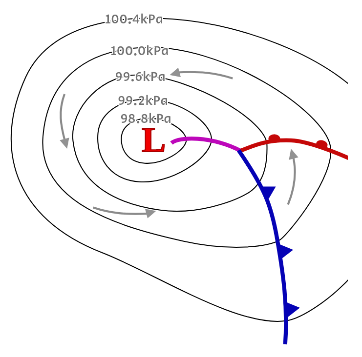
Fig. 5no.1 - Surface weather map for the Northern Hemisphere with isobars showing a low pressure centre in the middle, surrounded by regions of relatively higher pressure. The winds travel counterclockwise around the low pressure. The red line with semi-circles indicates a warm front, and the blue line with triangles indicates a cold front. The purple line is an occluded front, where the cold airmass (behind the cold front) has caught up with the warm air mass (associated with the warm front) and under-rides cooler air. The rising motion along all three fronts leads to condensation of water vapour and usually precipitation. (Credit: West).
-
Visible Satellite Imagery
Visible satellite imagery shows you a black and white version of what you would see if you were in space looking down on the earth. The sunlight illuminates the cloud tops at all levels in the atmosphere. These show up as light grey and white on the satellite image, and where there are no clouds, you can see the earth's surface, showing up as dark grey on the satellite image. The downside of visible imagery is that you cannot see anything at nighttime because there is no sunlight.
Interpretation of Visible Satellite Imagery
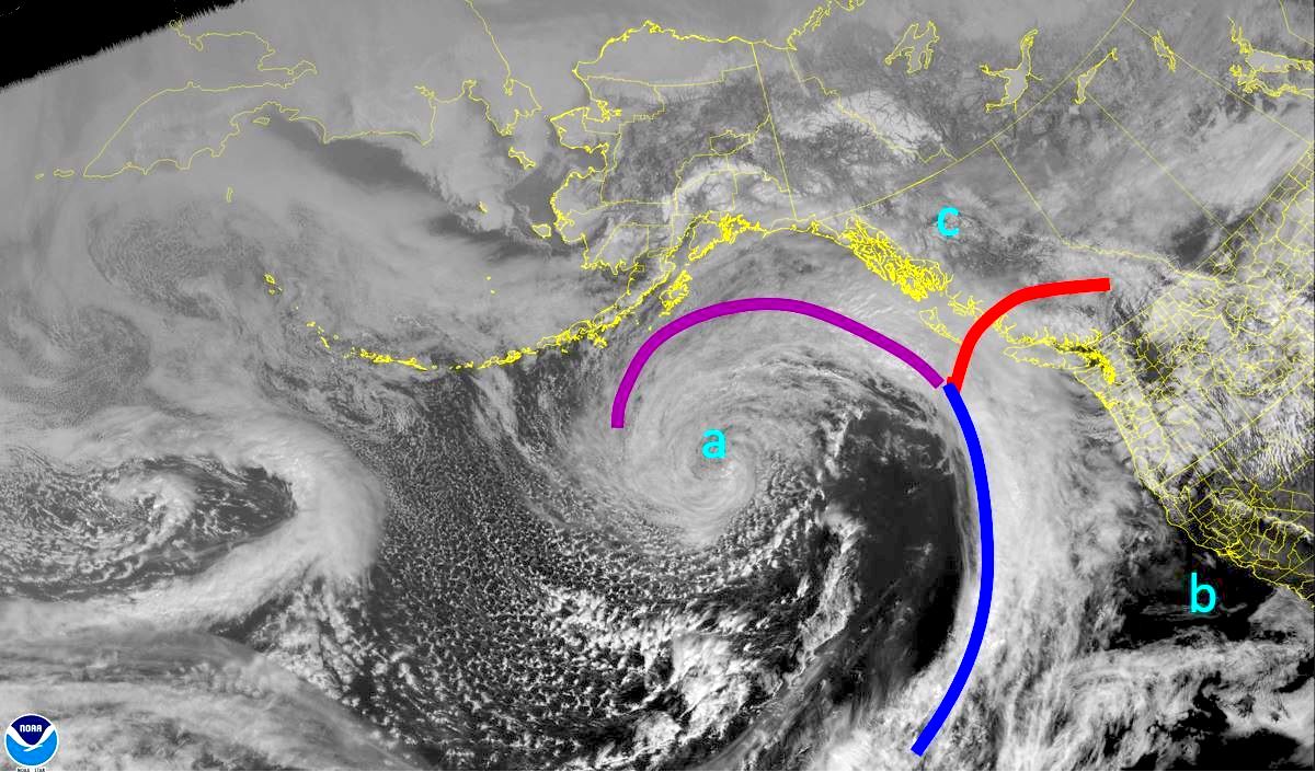
Fig. 5no.2 - Visible satellite image with interpreted features, from 3 PM PDT on 13 March 2022. The blue line denotes the cold front, the red line denotes the warm front, and the purple line denotes the occluded front. (a), (b), and (c) are referred to in the text. (Credit: CIRA/RAMMB GOES 17)
Fig. 5no.2 above is a visible satellite image from 3 PM PDT on 13 March 2022. The lines and annotations show a reasonable interpretation of where the fronts and other features are, as follows:
- Symbol "a": approximate low pressure centre. Click the "Visible Satellite Loop" button below to see the satellite loop ending at this time. It will will help you see the rotation around the low. (The loop is dark for the first few frames because it is still nighttime, and visible imagery is not available at night.)
- Blue line: cold front associated with the low pressure system. Remember that a cold front is always drawn on the warm side of the frontal zone, so most of the frontal clouds appear just behind the front, as the cold airmass wedges under and lifts the warmer air ahead of it. Cold fronts usually extend quite far south from low pressure systems. You can watch it develop in the loop.
- Red line: warm front associated with the low pressure system. Remember that the warm front is also always drawn on the warm side of the frontal zone, so a lot of the clouds appear ahead of it, as the warm air rises up slowly over the cooler air ahead of it. In the Pacific Northwest, warm fronts are usually quite a bit shorter than cold fronts and can be harder to identify.
- Purple line: occluded front, which extends from the junction of the warm and cold fronts back towards the low centre. You can watch the occlusion elongate in the loop (it is easier to see in conjunction with the IR loop discussed next). Occlusions typically occur where the cold airmass has caught up with the warm air and is under-riding it, so clouds also appear just ahead of the front.
- Symbol "b": clear air. You can interpret the dark greys as ocean and land, since you would see light greys or white if there were clouds present.
- Symbol "c": also clear air. You have to be careful here, because the white pattern under the "c" isn't clouds. This is fresh snow on the ground over northern B.C.!. This would be slightly more obvious on a more zoomed-in satellite image, where you can make out the terrain better. The lesson here is to consider if there are snow-capped mountains or if the temperatures have been cold enough for snowfall. A good clue is that snow on the ground or in the mountains doesn't move, whereas clouds do, so again the loop is useful here.
From CIRA / RAMMBS display of US NOAA satellite images. http://rammb.cira.colostate.edu/
-
Infrared Satellite Imagery
You have already viewed IR satellite images in Snow Modules A and B. IR sensors detect radiation in the thermal part of the spectrum, i.e. how hot or cold objects are. The amount of IR radiation reaching the satellite depends on the temperature of the object emitting that radiation.
Interpretation of IR Satellite Imagery
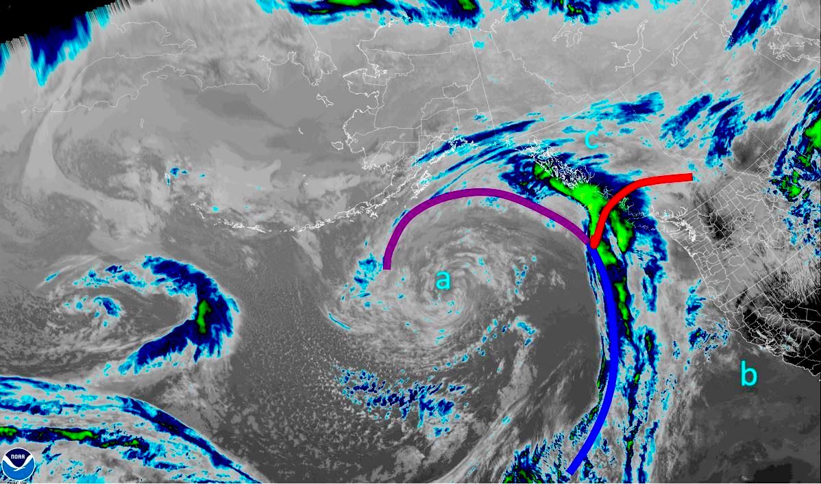
Fig. 5no.3 Infrared satellite image with interpreted features, from 3 PM PDT on 13 March 2022. The blue line denotes the cold front, the red line denotes the warm front, and the purple line denotes the occluded front. (a), (b), and (c) are explained in the text. (Credit: CIRA/RAMMB GOES 17)
The infrared (IR) image detects the temperature of objects (clouds, ocean, ground) that are emitting radiation. The warmer temperatures come from objects lower in the atmosphere, like low clouds, the ground, and the ocean - these show up as dark greys. Low clouds can be difficult or impossible to distinguish from the ground because they have a similar temperature. Medium-altitude clouds are cooler, and appear in the image as medium to lighter greys. Cold temperatures come from objects higher in the atmosphere, like higher cloud tops - these show up as /blue/green etc. The highest cloud tops here (green over the northeast Pacific Ocean) are around -60°C!
Note that you can only infer where cloud-tops are from IR images. That means you can't distinguish between high, thin clouds (cirrus) that contain little moisture and are not a weather hazard, and deep storm clouds that span much of depth of the troposphere and bring bad weather, based on temperatures alone. However, you can often infer storm and frontal locations by their shape and organization. Also, on a sunny afternoon, the land heats up sufficiently to appear almost black (the left, warmer end of the scale), but the ocean does not change temperature as much as the land, and therefore does not change colour as much. The best course of action is to use visible and IR satellite images together to deduce where threatening clouds or clear air are located.
Fig. 5no.3 above is an IR satellite image from the same time, roughly 3 PM PDT on 13 March 2022. The lines and annotations are in the same place:
- Symbol "a": approximate low pressure centre. The IR satellite loop below will help you see the rotation around the low to deduce where the centre lies.
- Blue line: cold front associated with the low pressure system. The high cloud tops (dark blues / greens) are mostly behind the front. Since we recognize the clouds along the blue line as a cold front, we can infer that it likely has deep (lower-, middle-, and upper-tropospheric) moisture with it.
- Red line: warm front. The high cloud tops appear ahead of it, with the highest clouds a short way ahead, as the warm airmass rises up slowly over the cooler air ahead of it. Often some of the high clouds well ahead of the warm front are just high cirrus clouds. Closer to the front deeper moisture is found.
- Purple line: occluded front. This was mostly interpreted by looking at the visible satellite, since there are no high cloud tops.
- From the visible satellite, we know that symbol "b" shows the location of clear air. However, on an IR satellite image, the ocean shows up lighter than the land (to the northeast of "b") because the land heats up more during the day. At 3 pm in March, the land would be warmer than the ocean. You also know that "b" is not an area with high cloud tops so it helps support your decision from looking at the visible image.
- From the visible satellite, we also know that symbol "c" shows the location of clear air. This is harder to see on IR than the visible satellite, and I would hesitate in interpreting it as clear air until I had looked at a visible satellite for the same time.
Nighttime blindspot
The main limitation of visible imagery (not visible at night), and the main limitation of IR imagery (difficult to see low clouds), combine forces during ski season. Often valley cloud forms at night (particularly in the BC Interior) under a high pressure pattern. Since valley cloud is nearly impossible to see on either visible or IR imagery in the early morning in winter, it can leave forecasters with a bit of a blind spot. The best tool to overcome this is looking at surface observations. Some weather stations, particularly those located at airports, will report cloud cover and visibility overnight. Looking at mountain webcams at sunrise can help as well.
-
Water Vapour Satellite Imagery
Water vapour satellite imagery is not actually useful for looking at the water vapour that plays a major role in our sensible weather, i.e. the water vapour near and at the surface of the earth. Instead, it shows water vapour in the upper half of the troposphere. It is mentioned here because it can be useful in the absence of visible and/or IR satellite imagery, but it is really only useful for looking at large-scale flow and features in the upper levels of the atmosphere. These aspects of the atmosphere are not covered in this course, so interpretation of water vapour imagery is likewise not covered.
-
Geocolor Satellite Imagery
The new geostationary satellites have many channels (e.g., visible colours, IR and others) that can be combined to give a very useful geocolor satellite image that looks realistic both day and night. Figure 4 shows a sample, for roughly the same time and date as the images above.
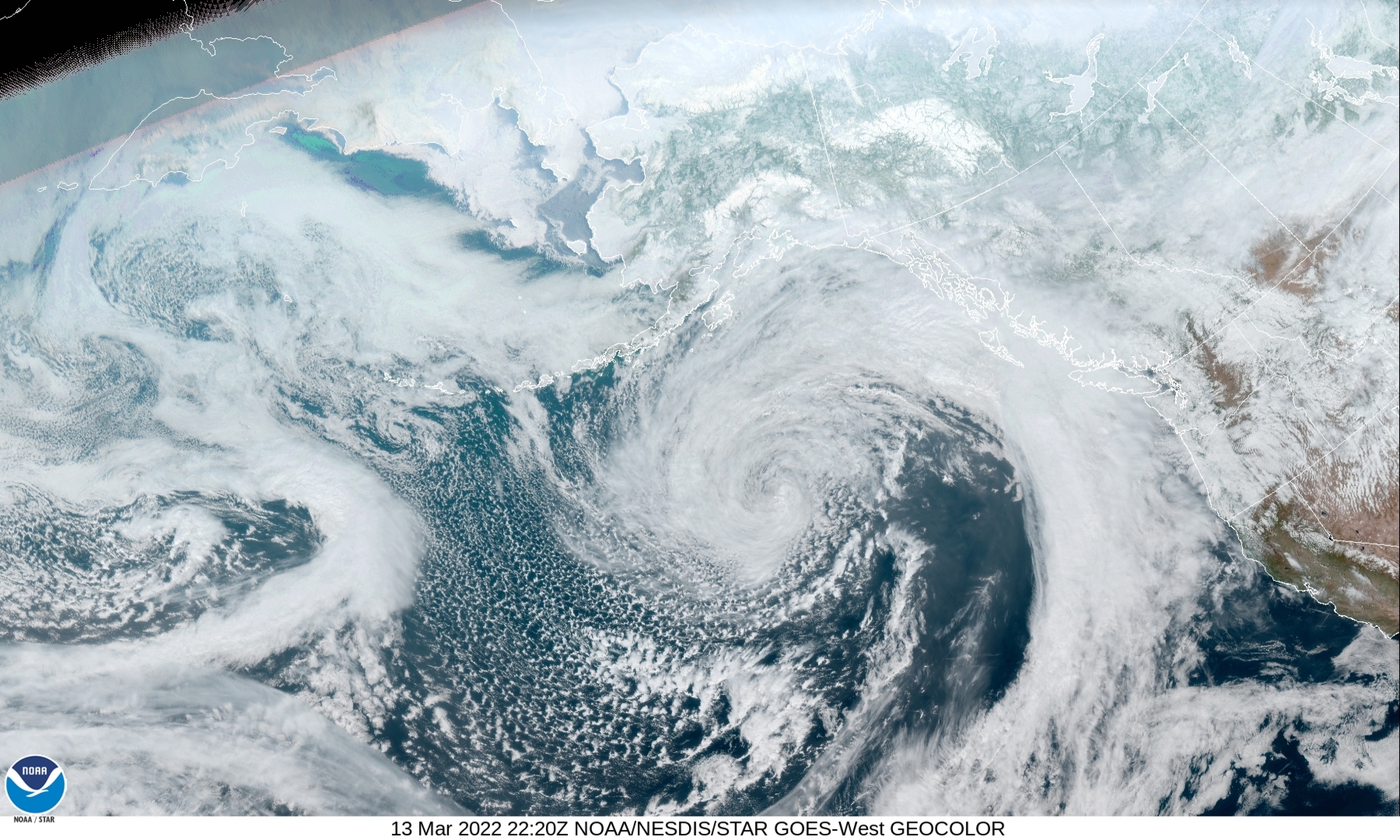
Fig. 5no.4. Geocolor satellite image, from 3:20 PM PDT on 13 March 2022. (Credit: CIRA/RAMMB GOES 17)
Here is a table summarizing how to identify different weather features on visible and IR satellite imagery. Limitations are also listed.
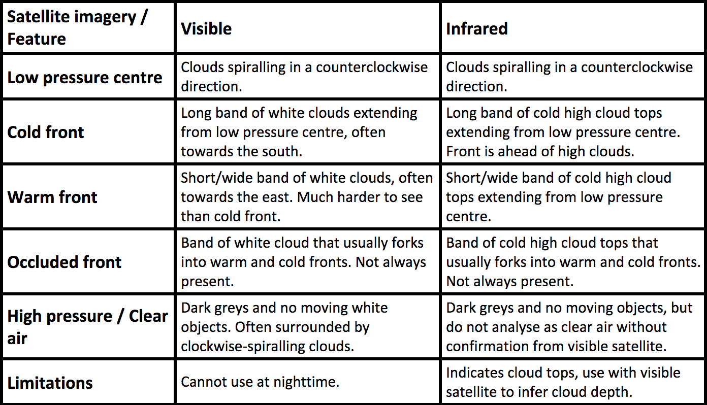
Table. 5no.1 - Summary of how to identify weather features (row headers) with useful types of satellite imagery (column headers). Also shown is limitations of the types of satellite imagery. (Credit: Howard and West).
Orbits
Geostationary Satellites (GOES):
Geostationary satellites are "parked" over the equator at a fixed longitude. An advantage is that they are good for taking time-lapse photos that you can view as a movie loop. The disadvantage is that they are so far away from Canada that they get a very oblique (slant) view of the provinces, and cannot see the northern parts of the territories and Arctic Canada at all.
One of my favorite sites is:
- UWisc. Space Science and Engineering Center (SSEC): https://www.ssec.wisc.edu/data/us_comp/large
Polar-Orbiting Satellites (POES):
Polar-orbiting satellites go (almost) over the North and South poles. While they orbit the earth, the earth turns underneath them. As a result, during each one orbit of the satellite, it observes a north-south swath of the earth's surface at high resolution. By the end of the day, enough swaths have been collected that they can be stitched together in the computer to make a single image of the whole globe. The advantage is that they have an excellent, vertical (straight down) view of Canada including the Canadian Arctic. The disadvantages are that you get only one global image per day, and each swath is photographed about 100 minutes earlier or later than the neighboring swath. Here is my favorite site, which is also zoomable:- NASA Worldview: https://worldview.earthdata.nasa.gov/
Notes to students:
- Don't memorize these web sites. But view them now and then to practice finding lows, high, and fronts.
- You will get more practice with satellite imagry later in the course, in Sailing learning goal 11d.
Keywords: infrared, visible, water vapour, geocolor, geostationary satellite, polar-orbiting satellite
Figure Credits
Howard: Rosie Howard
West: Greg West
Stull: Roland Stull
COMET/UCAR: The source of this material is
the
COMET® Website at http://meted.ucar.edu/ of the University Corporation
for Atmospheric Research (UCAR), sponsored in part through cooperative
agreement(s) with the National Oceanic and Atmospheric Administration
(NOAA), U.S. Department of Commerce (DOC). ©1997-2016 University
Corporation for Atmospheric Research. All Rights Reserved.
NOAA: Images courtesy of NOAA/NWS, www.nws.noaa.gov
NASA: Images courtesy of NASA, www.nasa.gov
Google: Map data (c) 2016 Google