ATSC 113 Weather for Sailing, Flying & Snow Sports
The Freezing Level and Rain vs. Snow
Learning goal 7a: Identify and forecast the freezing level and when precipitation will fall as rain vs. snow.
In Learning Goal 6h, we learned how to forecast temperatures at different elevations and pressure levels, based on (a) the forecasted temperature at a pressure-level, and (b) an assumed wet or dry adiabatic lapse rate. We'll use that knowledge here to teach you to forecast the infamous rain-snow line. Yes, that magical line that separates this (Fig. 7a.1):
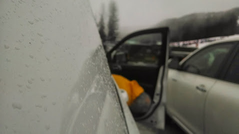
Fig. 7a.1 - A rainy parking lot at the base of Blackcomb Mountain. I call this one "Coast Mountain Powder Day"... somewhat ironically of course. (Credit: West)
...from this (Fig. 7a.2):
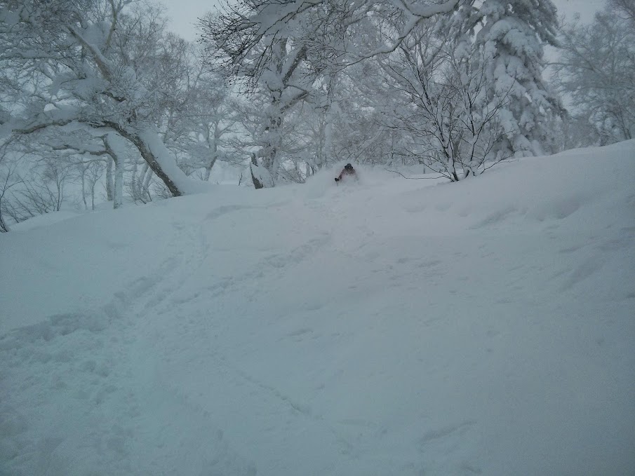
Fig. 7a.2 - Skiing well above the rain-snow line in Niseko, Japan. (Credit: West)
The rain-snow line is defined as the elevation at which
precipitation type transitions from rain to snow, which is usually at a slightly lower altitude than the freezing level.
Note: In non-mountainous regions, the rain-snow line terminology is used in a horizontal sense. That is, if you drive northward in an Ontario winter storm, you might go from a region where it's raining to a region where it's snowing. Here we mean it in a vertical (elevation) sense.
If you've spent any time skiing here at the BC South Coast, you've probably driven up through this elevation on the way from Squamish to Whistler. Perhaps you have ridden up in the gondola and seen the rain change to snow on your way up the mountain from the Whistler/Blackcomb base.
The rain-snow line is less of an issue in the BC Interior, since the base of the ski area is usually below freezing. Warmer and more variable temperatures are more common at in Coastal/Maritime snow climates (Learning Goal 7g). Unfortunately, even the top of North Shore Mountain ski areas are frequently on the rain side of the rain-snow line. Climate change has sadly determined that this line will continue to slowly move upward over the decades.
Freezing level vs. rain-snow line
Temperature typically decreases with height. This means that if lower elevations are above freezing and if you go up in elevation in the atmosphere, at some point you'll cross the freezing level, and get into below freezing air. Contrary to what you might think, the rain-snow line is typically not at exactly the same elevation at the freezing level. This is because as snow crystals fall from sub-freezing air into above-freezing air (i.e., from below 0°C to above 0°C), it takes time for them to melt. The time it takes depends upon the temperature gradient — how quickly it gets warmer with decreasing height — the size of the snow crystals, and the humidity. Generally, a good rule of thumb is that the the rain-snow line is roughly 300 m below the freezing level.
The rain-snow "line" is really a transition zone. You may notice that as you drive upwards on your way to Cypress Mountain on the North Shore, the raindrops landing on your windshield have slushy centres to them. Not too long after, you might see a mix of rain drops and snowflakes falling. Finally, wet snowflakes, and then just snowflakes.
By contrast, the elevation at which falling snow starts sticking to the ground (instead of melting upon contact) is typically close to the freezing level. This varies depending on the surface that the snow is falling on. If the snow is falling on an already present snow surface, it is more likely to stick. If it is falling on a warmer pavement, it will be more likely to melt.
Forecasting the rain-snow line using weather maps
To forecast the rain-snow line, simply use the vertical temperature
interpolation tool (Fig 7a.3) from Learning Goal 6h
to find the elevation of the
freezing level, and then subtract 300 m to estimate the rain-snow
line. Because we are dealing with precipitation, use the
Moist-air Tool for this interpolation:
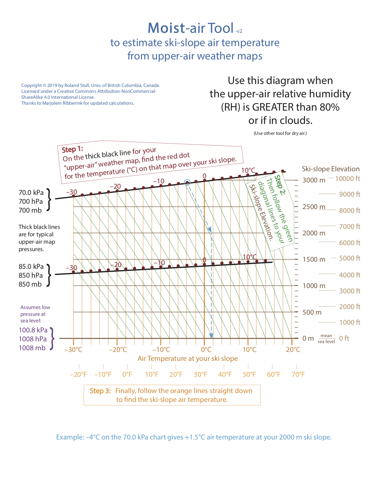
Fig. 7a.3 - A tool to allow easy estimation of temperature at your ski slope, for humid and foggy/cloud conditions. (Credit: Stull)
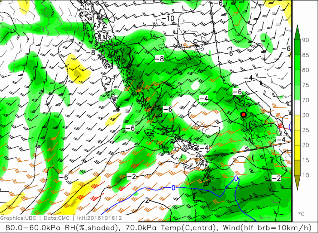
Fig. 7a.4 - A 70.0-kPa map with isotherms shown in solid and dashed (below freezing) contours. The red-in-black circle shows the location of Revelstoke. You can ignore the wind barbs for this example. (Credit: West)
Let's use the above map for an example (Fig. 7a.4). Over Revelstoke (the red/black circle in the figure above), the 70 kPa temperature is about -5°C, because it is approximately halfway between the -4 and -6 degC lines on the weather map. Let's assume we have already determined that we are expecting precipitation. We will use the Moist-air interpolation Tool because precipitation is usually associated with humid air.
Using the Moist-air Tool, first find the -5 degC temperature on the
70 kPa dark black line. Starting from that point, follow (or move
parallel to) the thin green line (the moist adiabat) downward until it
crosses the thick vertical orange line that represents 0 degC.
The altitude where this green and orange line cross is roughly at (or
slighly below) 2000 m, as you can read from the scale at the right side
of the Tool. This is the freezing level.
If the freezing level is at 2100 m, and if the snow can descend an additional 300 m before it is fully melted, then the elevation of the rain-snow line is (2100 m - 300 m) = 1,800 m. This is the answer. The rain-snow line is just below the top of Revelstoke Mountain Resort. That's OK, it's still early season!
Time Height Plots
Another very useful tool for forecasting the freezing level and rain-snow line is a time-height plot (Fig. 7a.5).
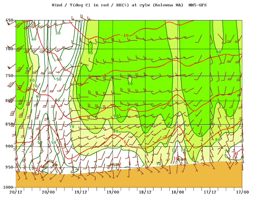
Fig. 7a.5 - A time-height forecast plot for Kelowna, BC. Height (in pressure, hPa, not kPa) is on the y-axis. Time is on the x-axis (format is date/UTC time). Time moves forward from right to left. That is, the far right side is the earliest time. Relative humidity is shaded, wind barbs are wind barbs, and temperature is shown in red contours. It appears as though the ground surface is changing elevation, but this is because the surface pressure is changing with time at the surface. (Credit: University of Washington)
In the above figure, freezing level is the 0°C isotherm (one of the red lines in that figure). You can see how its height changes with time through the forecast period, from right to left. To find the rain-snow line, convert the pressure level to an elevation, and then subtract 300 m.
Freezing-level forecast meteograms
Many forecast centres produce plots called meteograms. These show a time cross-section (much like in Fig. 7a.5) but the y-axis could be any weather variable such as surface temperature, or in this case, freezing level. Sometimes forecast centres run many models at once and use the average of these forecasts as their best estimate, plotted on a meteogram — this is called an ensemble forecast. For example, here is a meteogram showing the forecasted freezing level out to 7 days ahead (Fig. 7a.6), produced by the Weather Forecast Research Team at UBC (found here):
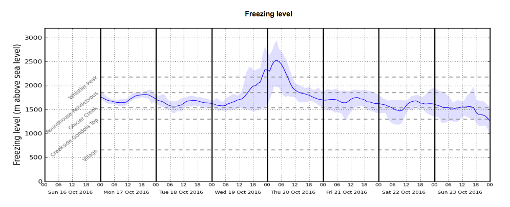
Fig. 7a.6 - A forecast meteogram of freezing level (in metres above sea level) for Whistler Village. Time moves ahead from left to right. The y-axis shows freezing level in metres above sea level. The thin blue line shows the average freezing-level forecast from multiple different NWP models, i.e., the best guess. The shaded region indicates uncertainty in the forecast, bounded by the miminum and maximum values produced by the ensemble. The dashed grey lines indicate the elevations of well-known locations on Whistler and Blackcomb mountains, labelled on the left. (Credit: Howard/Stull)
The freezing level is mostly below the Roundhouse/Rendevous (apart from Wednesday night/Thursday morning), which is good news for skiers! It is only October in this forecast, so hopefully the freezing level will continue to descend and stay consistently low later in Fall. Remember that this is the freezing level, and not the rain-snow line.
Weather station observations
Many mountain resorts have weather stations at different altitudes on the mountain. For example, the Whistler snow report gives live temperatures at four elevations on the mountain. Even if none of the stations report 0°C exactly, you can usually infer where the freezing level or rain-snow line is by interpolating between stations.
In this learning goal, we have given you a lot of data sources. This is because not all of these are available at every location where you might like to ski, so you have to pool what resources you can. We will teach more on resources in Module D.
Keywords: rain-snow line, freezing level, time-height, meteograms, ensemble forecast
Figure Credits
Howard: Rosie Howard
West: Greg West
Stull: Roland Stull
COMET/UCAR: The source of this material is
the COMET® Website at
http://meted.ucar.edu/ of the University Corporation for Atmospheric
Research (UCAR), sponsored in part through cooperative agreement(s)
with the National Oceanic and Atmospheric Administration (NOAA), U.S.
Department of Commerce (DOC). ©1997-2016 University Corporation for
Atmospheric Research. All Rights Reserved.
NOAA: Images courtesy of NOAA/NWS, www.nws.noaa.gov
NASA: Images courtesy of NASA, www.nasa.gov
Google: Map data (c) 2016 Google