Tutorial 1:
Basics of Understanding and Using Soundings
Intro
Objectives
The
focus is on understanding how temperature and humidity layering
(vertical structure) of the atmosphere controls thunderstorm intensity
and size. To do this, you will learn how to use a graph called a
"thermodynamic diagram" (or "thermo diagram" for short), to plot and
interpret atmospheric soundings.
Goals:
You will learn and practice how to:
- determine thunderstorm base, top, and the trigger needed to get the storm started
- identify the boundary layer, cap, troposphere, tropopause, and stratosphere
- use the thermo diagram to help calculate various humidities
- determine temperature change of vertically moving air parcels
- determine how much liquid water could be produced within one rising air parcel
- identify layers of stratiform and cumulus clouds
- find the static stability of the environment
- determine CAPE area and thunderstorm intensity
- interpret Skew-T diagrams
Needed Materials
1)
Before coming to this tutorial session, please print and bring with you
a few copies of each of the following pages. You can either buy the
printed materials from the bookstore as part of the course notes, or
can print them for free from the links below.
Printout S1. Thermo-diagram components (pdf)
Printout S2. Comparison of emagram and skew-T diagrams (pdf)
Printout S3. Complete thermo diagram (pdf)
Figure
numbers in these Printouts correspond to the figure numbers in the
Tutorial, where you can also find the figure captions. You might also
want to print out a copy of the Tutorial Activities to bring with you.
2)
Also bring some coloured pencils, eraser, and straight edge. If you
prefer to use coloured pens instead of pencils, that is fine, but you
might want to bring more blank copies of the above figures in case you
make mistakes when plotting the graphs.
Method
Activities .
The
instructor will explain, step-by-step, the different parts of a thermo
diagram and how to use them. You should follow along, plotting the
examples on your blank copy of Printouts S1 and S2.
These step-by-step examples are discussed in detail in the online
Tutorial readings. Then, on your own, after the tutorial is finished,
you should try doing the similar exercises (B1)
that are provided in the Activities link above, to help you gain
confidence and understanding in using thermo diagrams. Finally, do
similar calculations from real-time soundings you get from the web (B2).
Contents
1. The
Environment - Supportive or Oppresive
2. Soundings - to Measure the Environment
3. Air Parcels - Tracking them on Thermo
Diagrams
a.
Humidity of the Air
b. Rise of Unsaturated Air
c. Rise of Saturated Air
d. Full Thermo Diagram
4. Static
Stability (Additional Information - NOT Required)
a.
Buoyant Forces
b. Stability Classes
c. How to Determine Layer Stability
d. Interpretation of the Results
5. Predicting
Storm Intensity
a.
How to Find Parcel Stability
b. Tracking Parcel Rise
c. Convective Inhibition (CIN) and Triggering
d. Convective Available Potential Energy (CAPE)
6. Final
Conclusions and Review
Readings for Tutorial 1
1. The Environment
- Supportive or Oppressive
Two conditions are needed for a thunderstorm:
- an environment
in the troposphere that supports and encourages air parcels to rise, and
- a trigger
mechanism to kick-start the whole process.
To better understand the first condition, we need to understand both the environment around the storm (determined by soundings), and the
movement of air parcels through this storm. These are discussed in sections
2 - 4, and then are combined
in section 5 to see how storms
work.
Thunderstorms
need the right environment to form and grow. This is an environment that normally
prevents the warm, humid unsaturated
boundary-layer air from rising. The boundary layer can thus serve as a
reservoir to accumulate the sun's energy, to build up sufficient fuel
to power the thunderstorm. However, the environment must allow saturated air to be positively buoyant, so the cloudy air can continue
rising on its own once it has been kick started.
An environment
that allows saturated, cloud air to rise, but which prevents unsaturated air
from rising, is said to be conditionally
unstable. To determine this instability, one can measure the
existing temperature at different heights in the ambient environment, and
compare that to the temperature of a hypothetical blob of air called an air
parcel that is "kicked" up from the surface, past the capping inversion,
and which rises past its lifting condensation level (LCL) to become saturated (cloudy).
2. Soundings
- to Measure the Environment
The measurement
of the environmental air at various heights is called a "sounding",
or "upper-air data". Soundings are made by attaching meteorological
instruments to a radio transmitter, that can relay the observations as the
instruments move through the troposphere. Such instruments attached to rising
weather balloons are called radiosondes.
When dropped with a small parachute from an aircraft, they are called dropsondes.
When attached to small weather rockets, they are called rocketsondes.
Many commercial aircraft have special instruments to measure the weather and
automatically radio the info to ground stations. Satellites can roughly estimate
the sounding based on radiation that is emitted from the air at different
heights and received by the satellite. Even the time-delay to Global Positioning System (GPS) navigation signals between the GPS
satellites and ground stations can be used to infer the temperature and humidity
along the path.
Just to make
life confusing, the data that are collected from sounding instruments are
also called soundings.
Also, when this data are plotted on special charts called thermodynamic diagrams,
these plots are called soundings. We will focus on these sounding plots.
a. Thermo
Diagram Basics: Because pressure always decreases with height, meteorologists
use it as a surrogate measure of height. Lower pressures correspond to higher
altitudes. So most thermodynamic diagrams (thermo diagrams, for short) have
pressure plotted along the vertical axis (decreasing upward on the graph),
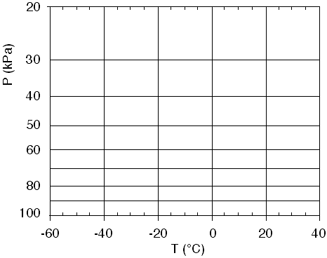
and temperature plotted along the horizontal axis. Fig 1 shows such a blank
graph. Thus, the top of the graph corresponds to higher altitudes, and the
right side corresponds to warmer temperatures.
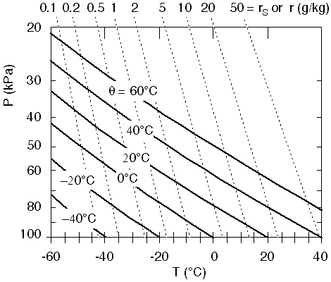
Fig
1. Background for a thermo diagram. Higher in the graph corresponds to
higher above ground (where the pressure is lower). P is pressure in
kiloPascals (kPa) and T is temperature in degrees Celsius (°C).
Horizontal lines are isobars and vertical lines are isotherms. Figure copyright © 2002 by Roland Stull.
In this diagram, along any vertical line the temperature (T) is constant. Hence, these vertical lines are called isotherms
(meaning equal temperature), and are labeled in degrees Celsius (°C) at
the bottom of each line.
Along any one
horizontal line, the pressure (P) is constant. These are called isobars, and are labeled in kiloPascals (kPa) at the left side of each line.
On this blank
graph, we can plot the sounding measurements. These measurements are often
reported as a temperature and dew point for a variety of heights. For each
height, plot two points on the chart: plot a large dot or small circle for
T and the plot an "x" for Td. Td is never
warmer than T, and can be much colder if the air is very dry. After the points
are plotted for each height, draw straight line segments to connect each T
point with its closest neighbor, starting from the lowest altitude (bottom
of the graph) and working up. This is just a "connect the dots"
exercise. Then draw a similar "connect the x's" for the Td
data points. Sometimes people use different colour for T and Td.
These two lines represent the sounding; namely the T curve represent the environmental
temperature, and the Td curve is a measure of the environmental
humidity.
Interpretation
of a sounding is as follows. First, check that the dew point line never crosses
to be warmer than the temperature line, otherwise you probably made a mistake
plotting the numbers (or there was an instrument error).
The bottom of
the sounding is usually the warmest and has the largest dew point, because
of the energy from the sun (sensible and latent heat) being transferred to
the air from the ground. The very bottom T and Td are used in the
calculation of LCL.
Near the top
of the sounding is often a layer of uniform temperature with height (i.e.,
an isothermal layer). This layer is in the stratosphere,
and the bottom of the isothermal layer marks the tropopause
(the dividing line between the top of the troposphere
and bottom of the stratosphere).
Any regions
where T and Td are equal or nearly equal (within about 1°C)
indicate layers of clouds. These are stratiform (layered) clouds if aloft,
or fog if touching the surface. (To be a cloud, theoretically T must exactly
equal Td so that the air is saturated. However, due to instrument
errors in the radiosondes, experience has shown that the sonde is probably
in a cloud even if the measured Td is within about 1°C
of T.) Here are a couple of examples,
b. Plotting
Environmental Soundings:
1)
Given the following sounding data, plot them on a copy of the blank thermo
diagram from Fig 1.
|
P(kPa)
|
T(°C)
|
Td(°C)
|
|
20
|
-30
|
-60
|
|
30
|
-30
|
-45
|
|
50
|
-10
|
-35
|
|
65
|
10
|
-20
|
|
80
|
25
|
-5
|
|
90
|
25
|
20
|
|
100
|
40
|
25
|
Table
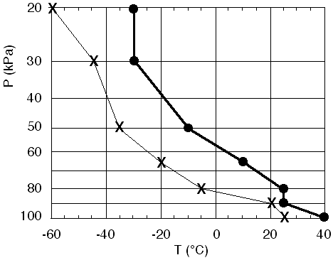
1. An atmospheric sounding of the environment.
where
the bottom measurement is for air touching the surface.
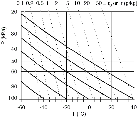
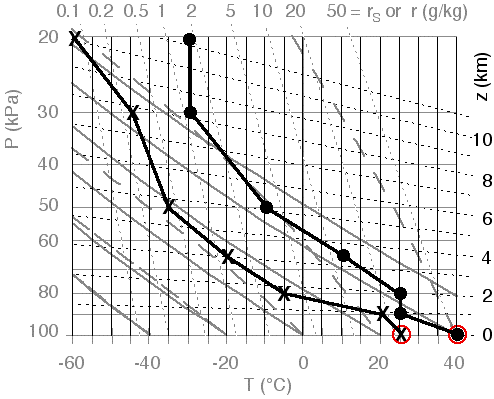
The
soundings are plotted in Fig 2, using dots for T, and x's for Td.
The boundary layer is the hot humid layer of air between the surface and a
height where the pressure is about 85
kPa. The capping inversion is the isothermal layer between 85
and 80 kPa. Below this stable
layer is the warm, humid air that can feed a thunderstorm. Above this cap,
the air is very dry, as indicated by the large differences between T and Td
at each height.
Fig
2. Plot of environmental sounding of Table 1.
Dots are temperature (T), and x's are dew-point temperature (Td). Figure copyright © 2002 by Roland Stull.
2)
For the sounding from the previous question, what is the value of the LCL
(i.e., the altitude of the cloud base), for an air parcel rising from near
the surface?
For
this calculation, we use only the data closest to the ground. Unless you are
told otherwise, assume that the air parcel starts with the same temperature
and humidity as the surrounding environmental air at that height (the surface
is near P = 100 kPa for this
example). Thus, at the surface T = 40°C
and Td = 25°C
from the table above. Plugging these numbers into the LCL equation (D2)
from the "Storm Energy" course notes gives
zLCL
= a • (T - Td)
zLCL
= (0.125 km/°C) •
(40 - 25°C)
zLCL = 1.875 km
3)
For the sounding from table 1, where is the tropopause?
There
is an isothermal layer of T = -30°C
near the top of the sounding, between pressures of 20
and 30 kPa. Thus, the bottom
of this layer, at P = 30 kPa,
marks the tropopause.
4)
At what levels are stratiform clouds, based on the sounding from part (1)?
There
are no locations where Td = T in this sounding, so there are no
stratiform clouds for this case. The closest approach is at P = 90
kPa, where T = 25 and Td
= 20°C.
Try
plotting and interpreting a sounding.
3. Air Parcels
- Tracking them on Thermo Diagrams
When air parcels
move around in thunderstorms, their temperature, pressure, humidity, and amount
of condensed water (cloud and rain drops) change. Thermo diagrams were devised
so that we could track these changes without having to do any calculations.
Instead, we can pick answers off of the diagram. For this reason, thermo diagrams
often have more than just isotherms and isobars plotted on them.
We will start
with the background thermo diagram of Fig 1, and gradually add more and more
lines as we discuss how to use them.
a. Humidity
of the Air
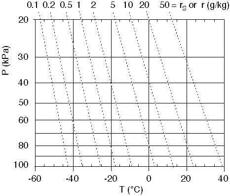
One set of lines that is usually added are isohumes, to aid calculation of humidity. These are shown in Fig 3
as the thin dotted lines (depending on your web browser and the resolution
of your screen, these dotted lines might appear as gray solid lines).
Isohumes connect locations in the diagram having equal humidity. The humidity
value for each isohume is labeled at the top of this thermo diagram as a mixing
ratio (r). (Careful! Different thermo diagram manufacturers can put the labels
in different places.)
The humidity
increases smoothly from lower left to upper right in this diagram. Thus, if
you need an isohume that is not plotted on the diagram (such as the 15
g/kg isohume), you should just interpolate smoothly between the two isotherms
that are closest (10 and 20
g/kg for Fig 3).
When you do
this interpolation for humidity, note that the humidity increases slowly at
first from the lower left, but then increases faster and faster as you approach
the upper right corner of the graph. Take this variation into consideration
when you interpolate.
When using the
isohumes in a thermo diagram, the following rules apply. For any point representing
temperature, the isohume that goes through that point tells you the saturation
mixing ratio, rs. For any point representing dew-point temperature, the isohume
that goes through that point tells you the actual mixing ratio, r.
Fig
3. Blank thermo diagram with
isohumes (thin dotted lines or gray lines depending on your screen resolution,
connecting points of equal humidity). The humidity values are mixing ratio
(r) in units of gwater/kgair , as indicated at the top of the graph. Figure copyright © 2002 by Roland Stull.
Let's look at
a couple of examples.
1)
For the bottom measurement from the previous solved example (P = 100
kPa, T = 40°C, Td
= 25°C), first plot them
in Fig 3.
2) find the actual mixing ratio
value (r).
3) find the saturation mixing
ratio (rs).
4) find the relative humidity
(%).
Answers:
1)
The same two points from the bottom of the previous solved example are plotted
in Fig 3, as reproduced as
Fig 4 here.
Fig
4. Plotting T and Td . Figure copyright © 2002 by Roland Stull.
2)
For the dew point measurement (plotted as the X), this point is slightly to
the right of the 20 g/kg isohume.
So I will guess r = 21 g/kg
for the actual mixing ratio. (Just to give me confidence, I double checked
using the humidity equations, and found r = 20.83
g/kg for T=25°C
at P=100 kPa.)
3)
For the temperature measurement (plotted as the dot), the dot is slightly
to the right of the 50 g/kg
isohume. By eye-balling it, we might guess about rs = 52
g/kg. (It is difficult to tell exactly from this graph, but I cheated by calculating rs based on the equations presented and got an answer of rs = 52.15
g/kg, using T = 40°C at
P = 100 kPa.)
4)
The thermo diagram does not give RH% directly. However, because we can get
both r and rs from it, we can use the definition
RH%
= 100 • r / rs
= 100 • (21
/ 52)
RH% = 40.4%
b. Rise of
Unsaturated Air Parcels
So far, we have
focused on the state of the air. Namely, its temperature, pressure, and humidity.
Just a reminder: it takes 2
points on a thermo diagram to represent that state of 1
air parcel. For example, the T and Td points plotted as the dot
and X in the previous solved example represent the one air parcel near the
ground. As we saw from that solved example, the state of that air parcel was
(P = 100 kPa, T = 40°C,
and r = 21 g/kg).
But thunderstorm
circulations move air parcels about and change their state; hence, we will
now look at processes that change the state of the air. Thermo diagrams can
have extra lines added to them to indicate processes (so that we can just
pick the numbers off the diagram, instead of calculating them).
Consider unsaturated
air parcels that rise from the surface under a thunderstorm. The following
rules apply to a rising air parcel:
- temperature
(T) cools dry adiabatically, and
- actual mixing
ratio (r) remains constant.
The second rule
above is easy. Since we already have isohumes plotted on these diagrams, and
since an isohume represents constant mixing ratio, all we need to do is to
move the X (representing the humidity of the parcel) up along, or parallel
to, the thin dotted isohumes.
For the first
rule, however, we need to add another set of lines, called dry
adiabats. These are shown in Fig 5
as the thick diagonal lines (where I have temporarily removed the isotherms
and isobars to help reduce clutter). These are lines of constant potential
temperature, which has the symbol theta ( ).
Often, thermo diagrams don't put labels on these adiabats, because it is understood
that their temperature value is that where it crosses the P=100
kPa isobar, near the bottom of the diagram.
).
Often, thermo diagrams don't put labels on these adiabats, because it is understood
that their temperature value is that where it crosses the P=100
kPa isobar, near the bottom of the diagram.
These dry adiabats
show the dry adiabatic lapse rate Gd , except using pressure P as the surrogate measure of height z.
The rule for
using these dry adiabats is as follows: For a rising or sinking air parcel
that is not saturated (not cloudy), the temperature of that air parcel changes
by following along (or parallel to) the dry adiabats. Namely, if a dot represents
the temperature T of an air parcel starting at some initial pressure height
P, then move that dot along (or parallel to) a diagonal line. Stop moving
it when you get to the desired different pressure level. The new location
of this dot within the thermo diagram indicates its new temperature.
The two rules
[temperature (T) cools dry adiabatically, and actual mixing ratio (r) remains
constant] can be used together, to find the lifting condensation level (LCL).
Remember that the LCL is nothing more than cloud base, where the rising air
parcel finally cools so much that water vapor starts condensing out to make
cloud droplets.) The rule for finding the LCL is:
- move the
dot (representing T) along the diagonal dry adiabat, and simultaneously
move the X (representing r) along the dotted isohume, until the dot and
X cross over each other. The location where they cross over is the altitude
of the LCL.
Finally, see
Fig 6, which is just like Fig
5 except the isotherms and
isobars are retained. This is the form that most people would actually use.
Fig
5. Thermodynamic diagram with
all lines removed except the isohumes (thin dotted lines representing mixing
ratio, r, labeled at the top), and the dry adiabats (thick diagonal lines,
labeled as potential temperature or theta ). Figure copyright © 2002 by Roland Stull.
.
Fig
6. Thermo diagram with isobars
(horizontal lines labeled with P at the left), isotherms (vertical lines labeled
with T at the bottom), isohumes (thin dotted lines labeled with r or rs
at the top), and dry adiabats (thick diagonal lines labeled with T at the
bottom). Figure copyright © 2002 by Roland Stull.
.
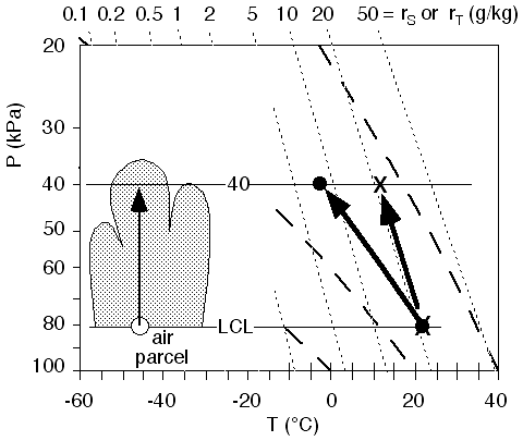
Now let's take a look at an example.
For
the bottom measurement from the previous solved example (P = 100
kPa, T = 40 °C, Td = 25
°C),
1) find the pressure altitude
of the LCL.
2) find the temperature, dew
point, mixing ratio, saturation mixing ratio, and relative humidity at the
LCL.
Answers:
The
T and Td points are plotted in Fig 7
below as the dot and X, as usual. The dot is lifted along or parallel to the
adiabats. The X is lifted along or parallel to the isohumes. Where those two
points cross is the LCL.
Fig
7. An air parcel at the surface,
represented by the dot for T and the 'X' for Td, is lifted to its
lifting condensation level (LCL). Figure copyright © 2002 by Roland Stull.
.
1)
Based on this diagram, it looks like the LCL is near P = 82
kPa. That was the pressure altitude that was asked for.
2)
If I were to have plotted this on Fig 6,
I would have found roughly that T = Td = 22°C,
and r = rs = 21 g/kg,
and thus RH% = 100% = 100 •
21/21. Thus, the state of the air at the LCL in this example is (P
= 82 kPa, T = 22°C, r =
21 g/kg, and the air is just saturated).
.
c. Rise of Saturated Air Parcels
Once a rising
air parcel has reached the LCL, any further rise will cause some of the water
vapour to condense out into cloud droplets (which can combine into larger
rain drops).
Latent heat
is released during condensation. Thus, a rising saturated air parcel doesn't
cool as fast as an unsaturated one. Hence, the saturated adiabats should not
slope as much as the dry ones, as was already discussed in the "Storm
Energy" course notes regarding the saturated-adiabatic lapse rate.
Although water
vapour is condensing into liquid droplets, one assumption that can be made
is that all of the liquid water, as well as remaining vapour, are still carried
along with the air parcel. This is a good assumption for cloud droplets, which
are so small and light that they are easily carried along with the air. What
this means is that total water mixing ratio (rT) is conserved.
But total water mixing ratio is defined as the sum of water-vapour mixing
ratio (rs) plus liquid-water mixing ratio (rL):
rT
= rs + rL
No water vapour
molecules are created or destroyed during condensation; they all are conserved
in one form (vapour) or another (liquid). So a simple rule is that if no liquid
water has fallen out of the air parcel, then its total water mixing ratio
equals its initial mixing ratio before it even started to rise from the ground
(rT = rinitially).
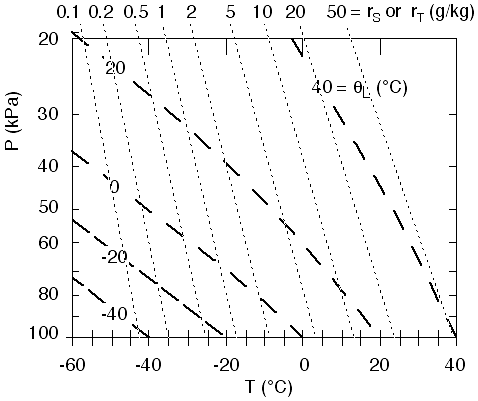
A simplified
thermo diagram with only saturated adiabats (curved, thick, dashed diagonal
lines) and isohumes (thin dotted lines) is shown in Fig 8.
Starting where we left off, with an air parcel at the LCL, the dot and X coincide
at the LCL. But as we lift the parcel further, the X continues following the
isohume, and now represents total water. The dot follows a saturated adiabat.
For example, if we were to lift the parcel to a height where P = 40
kPa, then the dot and X would both be moved to this altitude, but the dot
would still be on its saturated adiabat, while the X would still be on the
isohume.
The amount of
water vapour (r = rs) that can be held in the parcel depends on
its temperature and pressure, and can be read off of the thermo diagram from
the isohume that crosses through the dot. If the dot falls between two isohumes,
then interpolate as best you can. Thus, knowing rT from the isohume
that passes through the X, and knowing rs from the isohume that
passes through the dot, we can subtract the latter from the former to find
how much liquid water is being carried by the air parcel: rL =
rT - rs
Fig
8. Simplified thermo diagram,
showing only isohumes (thin dotted lines, labeled as r at the top) and saturated
adiabats (thick dashed lines, labeled as liquid water potential temperature
L). Figure copyright © 2002 by Roland Stull.
Here's a sample
question.
Starting
from the LCL of the previous example (T = Td = 22°C,
and r = rs = 21
g/kg, at P = 82 kPa), continue
lifting the cloudy air parcel up to an altitude where P = 40
kPa. Find its temperature, saturation mixing ratio, total water mixing ratio,
and amount of liquid water being carried along.
Answers:
1, 2)
Moving the dot (representing temperature) parallel to the saturated adiabats,
starting from the LCL, and ending at P = 40
kPa, gives: T = -3°C,
and rs = 8 g/kg
(see Fig 9).
3, 4, 5)
For standard air, Td = T = -3°C,
and r = rs = 8 g/kg.
Also, moving the X (representing total water) up to P = 40
kPa still gives rT = 21
g/kg (no change).
6)
Then, subtracting rs from rT gives rL = 13
g/kg. This means that each kilogram of air holds 13
grams of liquid water (cloud) droplets.
Fig
9. Rise of a saturated (cloudy)
air parcel from cloud base to a pressure height of P = 40
kPa. The dot follow the saturated adiabats, and shows how parcel temperature
changes, and the X follows an isohume, and shows total water mixing ratio. Figure copyright © 2002 by Roland Stull.
.
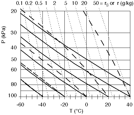
d. Full Thermo
Diagram
Fig 10
shows a complete thermo diagram, which contains all of the different types
of isopleths (lines of equal value) that are usually found in thermo diagrams.
It contains isobars (horizontal thin solid), isotherms (vertical thin solid),
isohumes (nearly vertical thin dotted), dry adiabats (diagonal thick solid)
and saturated adiabats (curved thick dashed). The isobars, isotherms, and
isohumes are labeled at the left, bottom, and top, respectively. The dry and
saturated adiabats are labeled at the bottom, by the temperatures where they
cross the 100 kPa isobar.
Fig
10. Complete thermo diagram. Figure copyright © 2002 by Roland Stull.
.
1) Printout S3
shows a full-size thermo diagram. It contains exactly the same information
as Fig 10,
but is larger and more detailed. This allows you to compute your
answers a bit more accurately, because interpolation is easier. This
type of thermo diagram is called an emagram. Click here to open Printout S3.
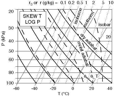
2) There are other types of thermo diagrams that are used, and which can be viewed on various web pages. These include the tephigram, Skew-T Log P (known as Skew-T for short), Stuve, and pseudoadiabatic diagrams.
The Stuve and pseudoadiabatic diagrams look very similar to the emagram
that was explained here. So these should be relatively easy for you to
use too.
a)
The tephigram and skew-T look similar to each other, but not to the
emagram. An example of a skew-T is shown in Fig 11. The main difference
is that the isotherms are not vertical, but they tilt upward to the
right. The isohumes and adiabats are also rotated slight to the right.
Whenever you encounter a new thermo diagram, take some time to read the
legend and labels to figure out where the isobars, isotherms, isohumes,
and dry and saturated adiabats are.
.
b) For example,
plot the sounding from Table 1 on this Skew-T diagram (answer not shown
here). Once you have done that, you can use the diagram analogously to
what has been described in all the previous examples.
Fig 11. Skew-T Thermo Diagram. Figure copyright © 2002 by Roland Stull.
.
4. Static Stability
a. Buoyant Forces
If
an air parcel is warmer than its environment, buoyancy tries to make it
rise (or slows its descent if previously sinking). If the air parcel is
colder than the environment, buoyancy tries to make it sink (or slows
its ascent if previously rising). If the parcel and environment are the
same temperature, then there is no net buoyancy force; therefore the
parcel stays put if previously not moving, or continues to coast if
previously moving.
b. Stability Classes
Air is said to be statically unstable
if the buoyancy force is in the same direction as the current movement
of the air parcel. Unstable air tends to become very turbulent with
strong vertical motions, and supports cumulus clouds and thunderstorms.
Air is statically stable
if the force opposes the current movement. Stable air has minimal
vertical motions, and is often nonturbulent (smooth or laminar), can
support smooth vertical oscillations (waves) in the air, and supports
stratiform clouds.
Air is statically neutral
if there is no buoyancy force. Neutral layers are often created by
strong turbulent mixing. So even though they don't enhance or surpress
their own turbulence, we must take care to see if factors from outside
are creating turbulence.
Air is conditionally unstable
if it opposes vertical motion for unsaturated air, but enhances
vertical motion for saturated (cloudy) air. Hence, different air
parcels behave differently within this layer, depending on whether the
parcel is cloudy or not.
That's all there is to static stability. Sounds easy enough.
But there are two tricky aspects.
- When
an air parcel moves up or down, its own temperature changes according
to the dry or moist adiabatic lapse rate (when it is unsaturated or
cloudy, respectively).
- As
the air parcel moves up or down, it moves into different layers of the
atmosphere that have different environmental temperatures.
Thus,
you must take care when moving air parcels up and down to see how both
the parcel and environmental conditions are changing, in order to
determine the forces that might cause continued or future movement.
Thermo diagrams were designed to make this job easier, as will be utilized in the following subsections.
c. How to Determine Layer Stability
There
are two ways to identify stability. One is layer stability, and the
other is parcel stability. Parcel stability will be discussed in
section 5, and is used
for estimating thunderstorm intensity. Layer stability just looks at
the environment, as will be summarized in this section.
For illustration of layer stability, lets start with the sounding from the previous solved example.
|
P (kPa)
|
T (°C)
|
Td (°C)
|
|
20
|
-30
|
-60
|
|
30
|
-30
|
-45
|
|
50
|
-10
|
-35
|
|
65
|
10
|
-20
|
|
80
|
25
|
-5
|
|
90
|
25
|
20
|
|
100
|
40
|
25
|
Table 1. (again) Atmospheric sounding of the environment.
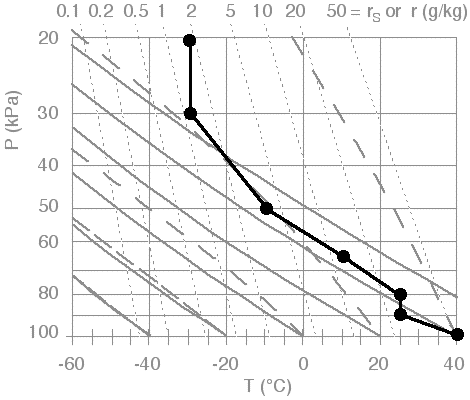
I will start with the blank thermo diagram of Fig 10, and plot just the temperature part of the sounding to produce the result shown in Fig 12. You should follow along, but using Printout S3 instead.
Fig 12. Plot of environmental sounding (temperature part only). Figure copyright © 2002 by Roland Stull.
.
1)
We will look at unsaturated (non-cloudy) layer stability. First,
determine unstable regions. For each data point that was plotted,
conceptually raise it a little bit as if it were an air parcel, but do
this following (or parallel to) a dry adiabat. If this parcel is warmer
than its surroundings at the same altitude, then continue to lift it
following the dry adiabat until it crosses the sounding again. The
region between the starting point and where it crosses the sounding is
labeled as "unstable". Do this for all the other starting points
(original data points), to identify all the unstable regions.
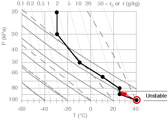
In the illustration of Fig 12, we find that the data point at the ground (starting at P = 100
kPa) is unstable if lifted. Because it is warmer than its surrounding
environment, it would continue to rise along a dry adiabat until it
hits the sounding (at about P = 85
kPa for this sounding). Notice that the top of this unstable layer
doesn't have to be at another data point; namely, it can be inbetween
two data points if that is where the rising parcel happens to cross the
sounding. The result is shown in Fig 13.
When we conceptually start lifting the other data points in this
sounding, we find no other unstable layers. So for this particular
example, there was only one unstable layer, as is plotted in Fig 13.
Fig 13. Unstable layers identified by conceptually lifting data points along dry adiabats. Figure copyright © 2002 by Roland Stull.
.
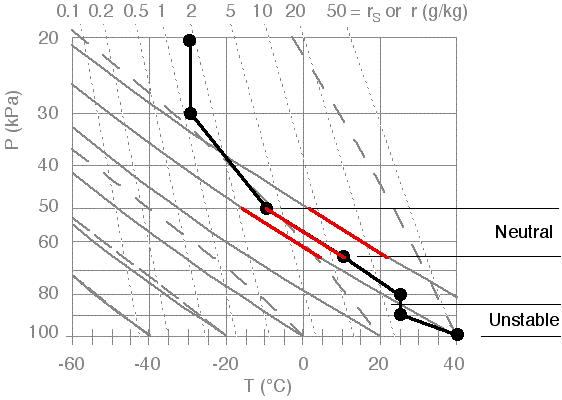
2)
Next, identify statically neutral layers. Do this only for those
regions NOT already identified as unstable. Neutral regions are where
the sounding is nearly parallel to the nearest dry adiabats. These are
identified in Fig 14. In this illustration, there is only one neutral layer. Note that there is another layer just below 65
kPa that is nearly neutral (i.e., nearly parallel to the dry adiabats),
but not quite. This layer is so close to neutral that it would have
been acceptable to also identify it as neutral.
Fig 14. Illustration of identifying statically neutral layers. Figure copyright © 2002 by Roland Stull.
.
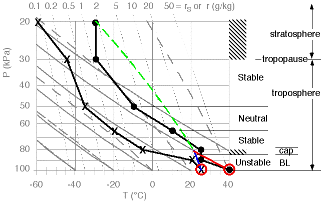
3)
Finally, identify the stable layers as any remaining layer. Stable
layers are said to be strongly stable if T is constant with height
(isothermal), or if T increases with height (temperature inversion). This is done in Fig 15, which now holds the complete stability classification of all the regions in the sounding.
4) In this illustration, two of the stable layers are isothermal (one between P = 20 and 30 kPa, and the other between 80 and 85 kPa), and there are no inversion layers. I've indicated these regions of strong stability with cross hatching.
.
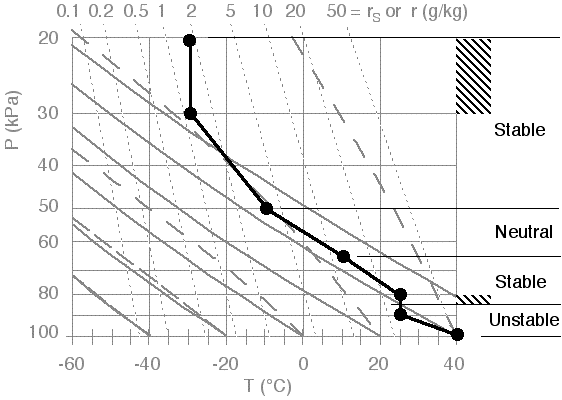 |
Fig 15. Stability of the whole sounding, where regions of strong stability are identified with cross hatching. Figure copyright © 2002 by Roland Stull.
.
Different
layers of the atmosphere have different stabilities. For example, the
stratosphere is always strongly statically stable. Namely, vertical
motions are opposed because the stratospheric environment is isothermal
(T constant with z) in the bottom 1/4, and has a deep temperature inversion (T increases with z) in the top 3/4. Thus, the base of the stratosphere (averaging 11
km altitude) always acts like a lid or cap to ALL weather in the
troposphere, including thunderstorms, hurricanes, and cyclones.
Below the stratosphere is the troposphere (0 - 11 km), where most of our interesting weather happens. The dividing line between the troposphere and stratosphere is called the tropopause,
or "trope" for short. Within the troposphere, stabilities vary from
place to place, season to season, day to day, and hour to hour. So we
must frequently measure the environmental sounding and air-parcel
conditions to see how the static stability is changing. Most national
weather services around the world make routine upper-air soundings
twice a day or more frequently, in order to monitor such instabilities.
d. Interpretation of the Results
Now that the stability of the whole sounding has been identified in Fig 15, we can identify it as the thunderstorm environment. This interpretation is written in Fig 16, where we have also plotted the dew point temperatures that we have ignored so far.
1)
"BL" is the boundary layer, holding the warm, humid air that is fuel
for the storm. A deeper, warmer, and more humid BL could support more
thunderstorm activity.
"Cap"
is the capping stable layer, which is both good and bad for the
thunderstorm. It is good because it traps the warm, humid air below it
in the boundary layer, to serve as a reservoir of fuel for the
thunderstorms. But this cap must first be broken by some outside
trigger, in order to get the fuel up to where condensation can release
its latent heat to power the thunderstorm. A thicker and more stable
cap inhibits convection and is more difficult to break, making
thunderstorms less likely to start.
2)
The stratosphere is the isothermal layer near the top of the sounding.
The tropopause at the base of the stratosphere marks where the top of
the thunderstorm will be. The anvil cloud can be expected to spread out just under the tropopause.
The
rest of the troposphere, above the cap and below the tropopause, is
where the active part of the storm can be. There is where latent heat
is released through condensation, and where the resulting extra
buoyancy drives the vertical circulation that continues to draw in more
boundary layer fuel. Thunderstorm severity (hail, downpours,
downbursts, turbulence) increases if this middle layer is drier and
colder.
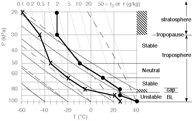 |
Fig 16. Interpretation of the environmental sounding. Figure copyright © 2002 by Roland Stull.
.
3)
The conditions that are most conducive to severe thunderstorms are warm
moist air near the ground, capped by a statically stable layer, with
dry air in the mid troposphere and cold air aloft. This
arrangement creates a conditionally unstable atmosphere.
We haven't talked about wind yet, but when rawinsonde balloons are
launched to measure the upper air sounding, they also report back winds
at each height. The change of wind speed or direction with height is
called wind shear. Wind shear near the ground is good
for the thunderstorm, because it helps advect the warm humid boundary
layer air that fuels the storm, allowing the storm to be longer
lasting. The shear also creates a twisting motion (vorticity)
that can be tilted into a tornado by the thunderstorm. Strong winds
aloft also favor intense, rotating, long-lived thunderstorms called supercell storms.
.
5. Predicting Storm Intensity
a. How to Find
Parcel Stability
The next step
in estimating likely thunderstorm intensity is to see what would happen if
a warm, humid air parcel were forceably lifted from near the surface by a
trigger mechanism. Such parcel stability must consider that an air parcel
from the surface can pass through many layers; hence, we must look beyond
simple layer stability.
By combining
information on air parcel behavior (section 3)
with information on the environment (sections 2
and 4), we can estimate both
trigger strength needed to kick start the storm, and intensity of the resulting
storm.
The steps to
do this are:
(a) Plot and
interpret the sounding on a full thermo diagram (as was shown in section
4).
(b) Track an air parcel lifted from the surface to the top of the sounding.
(c) Determine lifting or heating needed by a trigger to break the inversion.
(d) Find the depth and energy of the storm.
We have already
illustrated step (a) in the previous section.
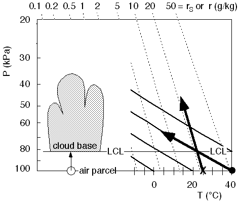
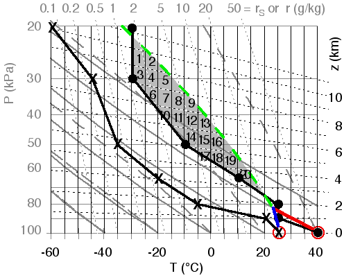
b. Tracking Parcel
Rise
We will conceptually
lift an air parcel from the surface up to the top of the sounding, regardless
of whether the parcel is buoyant or not. Along the way, it will pass through
many layers. For now, assume that the starting T and Td of the
air parcel are assumed to be the same as those measured at the very bottom
of the environmental sounding (i.e., the bottom data point).
As we learned
in section 2, start by moving
the temperature along (or parallel to) a dry adiabat (shown in red in Fig
18), and moving the dew point
along (or parallel to) an isohume (shown in blue), until they meet at the
LCL. Above the LCL, have T follow (go parallel to) a saturated adiabat (shown
in green) up to the top of the sounding. For now, ignore (don't plot) Td
and rT above the LCL.
Fig
18. Tracking the rise of an
air parcel from the surface. Figure copyright © 2002 by Roland Stull.
.
Interpreting
this figure, we see that the surface air parcel could rise due to its own
buoyancy through the boundary layer, and up to the capping stable layer at
pressure altitude 85 kPa. The
symbol zi is used to designate the top of the boundary layer.
To go higher,
it would have to be forceably lifted through this cap, because the parcel
at these altitudes is cooler than the environmental sounding, and would prefer
to sink rather than rise because of its negative buoyancy. However, if such
lifting did occur, the parcel would reach its Lifting Condensation Level (LCL),
which marks cloud base.
If
the (now cloudy) parcel were forceably lifted high enough, it would
find itself warmer than the environment again. This altitude is called
the Level of Free Convection (LFC).
Above the LFC, the parcel could continue rising on its own buoyancy up until
it hits the the sounding again in the lower stratosphere. This top altitude
is called the Limit of Convection (LOC), and marks cloud top.
These various
altitudes are sketched in Fig 19,
which is a simplified version of a thermo diagram.
Fig
19. Key altitudes for parcel
stability, sketched on a bare-bones thermo diagram. Base and top of the thunderstorm
cloud are at LCL and LOC, respectively. Figure copyright © 2002 by Roland Stull.
.
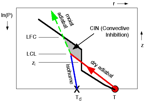
c. Convective Inhibition (CIN) and Triggering
In the previous
subsection, we saw that the region between the top of the mixed layer zi
and the LFC is the region where the air parcel is cooler than the surrounding
environment. This is the region that inhibits convection; namely, it acts
like a lid to updrafts, preventing them from vertically growing into thunderstorms.
It is the region that must be overpowered by forced lifting by an external
trigger mechanism, or eliminated via more heating from the surface.
The strength
of this lid is measured by the area between the ambient sounding and the air
parcel temperature (shaded in Fig 20), for only the portion of the air parcel temperature that is cooler than the environment. This area is called the Convective Inhibition (CIN). Larger values of CIN correspond to stronger
lids, and indicate that triggering of thunderstorms is more difficult (i.e.,
a stronger trigger is needed to kick start a thunderstorm). Smaller CINs indicate
that thunderstorms are more easily triggered, and thus more likely (everything
else being equal).
Fig
20. Enlargement of the bottom
third of Fig 19. Black line
represents the ambient environmental sounding. Red circle represents an air
parcel starting near the surface. Red and green lines show how the air parcel
temperature changes as it rises. Convective inhibition (CIN) is the area (shaded)
between the top of the mixed layer zi and the level of free convection LFC. Figure copyright © 2002 by Roland Stull.
.
Two ways of
eliminating the effect of this lid are by forced lifting, or by heating of
surface-layer air. The first method overpowers the lid, the second eliminates
the lid.
1)
Forced lifting could be caused by a cold front, gust front, dry line, or sea-breeze.
In these situations, an advancing wedge of cold air drives under the warm
air parcel and forces it upwards. This is because the advancing cold air is
heavier than the warm air parcel, and tends to ride under the parcel. This
way, the air parcel can be forced up to its LFC, even though the parcel buoyancy
is negative during a portion of its rise. A similar trigger mechanism is where
the wind blows the warm air parcel to a mountain slope, forcing the parcel
to rise upslope. A thunderstorm triggered this way is called an orographic
thunderstorm. These forcings are illustrated in Fig 21.
For Fig 18, the LFC is of approximately
73 kPa. A better estimate is
possible using the full thermo diagram of printout S3.
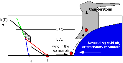 |
Fig
21. Air parcel (red circle)
being forced upward over an obstacle. The obstacle could be a mountain, or
a mass of cold air advancing as a cold front or as a gust front from a different,
older thunderstorm. If forced up past the LFC, then the parcel can continue
rising by its own buoyancy, to create a thunderstorm. Figure copyright © 2002 by Roland Stull.
.
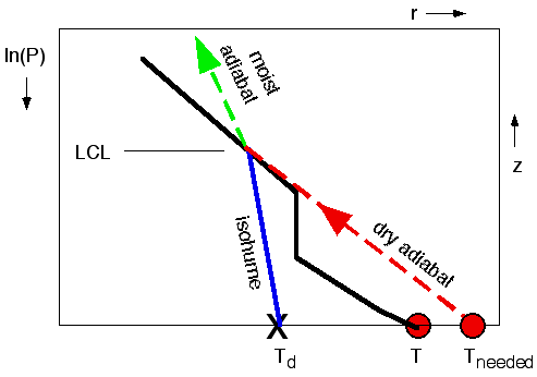
2)
Thunderstorm convection can be initiated due to surface heating that eliminates
the lid, as sketched in Fig 22
for the bottom third of the troposphere again. The black line might represent
the environmental sounding in mid morning, where part of the isothermal layer
caps thermals rising from the surface. We can anticipate that if the surface
temperature becomes warm enough (Tneeded in Fig 22),
then the air parcel would always remain warmer than the environment sounding
as it rises. This critical temperature is called the convective initiation
temperature. If more and more heating from the sun during the day causes the
near-surface air temperature to warm toward this critical temperature, then
we could forecast thunderstorms to begin when that critical temperature is
reached.
From Fig 18,
Tneeded = 45°C,
approximately. A better estimate of Tneeded can be found using the full thermo
diagram in prinout S3.
Fig
22. The lid can be "burned
off" if the surface air temperature warms sufficiently (from T to Tneeded)
during the day so that the adiabatic rise of the surface air parcel
(dry adiabatically up to its LCL, and moist adiabatically above that)
is everywhere warmer than the ambient environment sounding. Figure copyright © 2002 by Roland Stull.
.
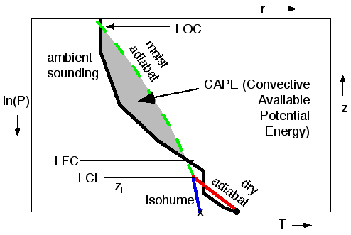
d. Convective
Available Potential Energy (CAPE)
Once a thunderstorm
is successfully triggered, the next question is "how intense could it
become?" One indicator is the depth of the storm: deeper storms are generally
more violent. The top of the thunderstorm is near the LOC, and the base is
near the LCL. The difference between these two heights is the depth of the
storm. Thus, thunderstorms with tops in the lower stratosphere and bases near
the ground are often severe.
A more quantitative
way to estimate storm intensity is by the area (shaded in Fig 23)
between the air parcel's moist adiabat and the environmental sounding (above
the LFC and below the LOC). This area is proportional to the Convective Available
Potential Energy, or CAPE for short. Larger CAPE areas indicate more intense
storms. The reason is that buoyant forces are proportional to how much hotter
the rising air parcel is compared to the environment. The acceleration of
this air parcel also depends on the vertical distance over which this positive
buoyancy acts. The combination of this vertical distance times temperature
excess is the CAPE area just described.
The relationship
between CAPE and potential storm intensity is given in Table BB, where CAPE(m2/s2)
= 38 • CAPE (°C • km).
.
Table
BB. Estimates of thunderstorm intensity vs. CAPE.
|
CAPE
(°C • km)
|
CAPE
(m2/s2)
|
Intensity
|
|
CAPE
< 0
|
CAPE
< 0
|
No
convection
|
|
0
< CAPE < 26
|
0
< CAPE < 1000
|
Weak
convection / cumulus
|
|
26
< CAPE < 66
|
1000
< CAPE < 2500
|
Moderate
thunderstorms
|
|
66
< CAPE < 92
|
2500
< CAPE < 3500
|
Strong
thunderstorms
|
|
92
< CAPE
|
3500
< CAPE
|
Severe
thunderstorms
|
.
Fig
23.
CAPE indicates the possible intensity of the thunderstorm, and is
proportional to the area shaded. In this region, the air parcel is
warmer than the environment, and tends to accelerate upward due to its
positive buoyancy. Figure copyright © 2002 by Roland Stull.
.
To
estimate the CAPE area, a quick way is to count the number of boxes of
T (°C) vs. z (km) needed to fill the shaded area. Multiply this number
by the area of each box, to get the total area in units of °C·km.
To
do this, we can use a version of the thermo diagram that also has lines
of constant height (z) plotted. These lines are called heights or
contours, and are shown in Fig 24. Also, the full-size thermo diagram of Printout S3 has the height contours. It is this full size diagram that should be used for all real soundings, because it is more precise.
In Fig 24,
we have numbered each box that is filled with shading just to
illustrate the box counting. If some boxes that we counted are only
partly shaded, then we must compensate by not counting other partially
shaded boxes. Use your judgement, so that the total area tiled by these
boxes is roughly equal to the total area shaded in the CAPE diagram.
For example, box 1 is
not fully shaded -- the upper right corner is missing shading. However,
there is a little bit of extra shading in the box just left of box 1,
and an even smaller bit in the box above that. By eye, the portion of
shading in these additional boxes looks about right to compensate for
the empty corner of box 1. Similar judgement calls must be made for the other boxes.
For Figs 23 and 24, I count 11 boxes. In this diagram, each box is 5°C wide by 1 km high; thus, each box has an area = (5°C)·(1 km) = 5 °C·km. Thus, the total area = (11 boxes) x (5 °C·km/box) = 55 °C·km. However, the diagrams in Figs 23 and 24
were meant for illustration only. The sounding plotted in them was not
the same as the sounding of our example that we have been using
through-out this lab.
Fig 24.
Method of calculating CAPE, by counting the number of boxes needed to
fill the shaded area. The dotted, nearly horizontal lines are height
contours, labeled by z on the right. Figure copyright © 2002 by Roland Stull.
.
For figures 23 and 24, CAPE = 55 °C•km for which Table BB indicates moderately intense storms.
Let's see an example.
Given Fig 25,
which shows the original sounding plotted on a thermo diagram that has
the extra height lines and temperature lines to calculate CAPE.
1) In Fig 25,
draw lines for the rise of the surface air parcel following dry or
moist adiabats as appropriate, up to the top of the diagram. The LOC of
the top of the storm is approximately at p = 22kPa.
2a) Identify the CAPE area, count the boxes in it.
2b) Determine the total area tiled by the boxes. This area is the CAPE = ____________°C•km
2c) Classify the intensity of the thunderstorm.
Fig 25. The original sounding of Table 1,
plotted on a complete thermo diagram with height (z) and temperature
(T) lines highlighted. The red circles indicate the temperature and
dew-point of the surface air parcel. Figure copyright © 2002 by Roland Stull.
Answers:
The answer is shown in Fig 26,
with red lines showing the dry adiatabic rise of the parcel up to its
LCL, and the green line showing the remainder of its rise parallel to
the moist adiabats. The CAPE area between the parcel and the
environment, above the LFC and below the LOC is shaded. I count roughly
20 boxes, where each box in this diagram area = 5 °C·km. Thus, I get a total convective available potential energy of CAPE = 20 • (5 °C·km) = 100 °C•km, which suggests that severe thunderstorms are possible.
Fig 26. Rise of the surface air
parcel (red circle) is shown with the red, blue, and green lines. CAPE is
proportional to the shaded area between the moist adiabat (green line) of
the rising air parcel, and the temperature (black line) of the environment.
This area can be covered by roughly 20
boxes, where each box is 5°C
wide and 1 km high. Figure copyright © 2002 by Roland Stull.
.
6. Final Conclusions
and Review
- Thunderstorm
cloud base is at the LCL.
- Thunderstorm
anvil is at the LOC.
- Warm humid
boundary-layer air (i.e., air near the ground) is capped by a convective
inhibition (CIN) region that prevents thunderstorm formation.
- CIN bottom
is at Zi, and CIN top si at the LFC.
- Thunderstorms
can be triggered by overpowering the CIN by either lifting or warming of
boundary-layer air.
- Boundary-layer
top is at Zi (i.e., at the base of the CIN).
- Near pressure
altitude of 30 kPa is the
tropopause, the boundary between the stratosphere above (where air is approximately
isothermal) and the troposphere below.
- rs
is found from T.
- r is found
from Td.
- RH% = (100%)
• r/rs
- Rising air
parcels cool adiabatically.
- Dry adiabatically below the LCL.
- Moist adiabatically above the LCL.
- If no rainout,
then rL = rT - rs, where rT
is the initial r of the air parcel near the surface and rs is
found from T at the height of interest.
- Stratiform
clouds exist where environmental T = Td.
- Thunderstorm
intensity is proportional to the area between the environment and the rising
parcel's moist adiabats, between the altitudes of LFC and LOC.
Copyright 2002 by Roland Stull
UBC ATSC
.