Tutorial 2: Creating Thermo Diagrams on Spreadsheets
- Strengthen spreadsheet creation skills
- Enhance understanding of thermodynamic diagrams
Method: Demonstration by Professor using a computer-projected spreadsheet, with students doing similar work on their workstations in a computer lab room.
- Construction of an Emagram thermo diagram on a computer spreadsheet by solving the governing equations.
- Plot a sounding on the resulting spreadsheet thermodynamic diagram, and compare with the same sounding plotted on other types of thermo diagrams (skew-T, Stuve, emagram, tephigram).
A. Spreadsheet Thermodynamics - The Emagram
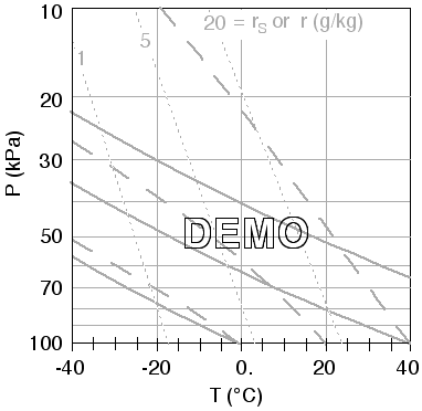
- Your goal is to use a computer spreadsheet to create a basic thermodynamic diagram called an Emagram (see example at end of section A) with isotherms, isobars, isohumes, and dry and moist adiabats. If your computer has limited capacity, you might want to print these instructions and print the example Emagram, then quit your web browser, and open your spreadsheet program. The background Emagram you create here will be used in part B below to plot a sounding.
.
- Dry Adiabats. For each of the Theta = 0, 40, and 80 C adiabats, calculate P(kPa) vs. T(C), for temperatures of -40, -20, 0, 20, 40 C.
- To do this, rearrange the definition of potential temperature to solve for pressure:
P = Po * ( ( ( T+273)/(theta+273) )^(Cp/R) )
where Po = 100 kPa, Cp/R = 3.5, the ^ symbol means "to the power of", and the symbol * means "multiply".
- Then, create a table in the spreadsheet as shown below in Table 1, solving for the pressure as a function of T and theta. The answers for Theta = 40 C are given in the table below as a check of your own work, where the non-bold numbers are pressures in kPa.
.
Table 1. Spreadsheet to calculate pressures along dry adiabats.
| . |
A |
B |
C |
D |
| 1 |
. |
Theta (C) |
| 2 |
T (C) |
0 |
40 |
80 |
| 3 |
-40 |
. |
35.6 |
. |
| 4 |
-20 |
. |
47.5 |
. |
| 5 |
0 |
. |
62.0 |
. |
| 6 |
20 |
. |
79.4 |
. |
| 7 |
40 |
. |
100.0 |
. |
- Plot these data on the spreadsheet (Hint, select a "XY scatter" chart, not a "line" chart, then choose a version with straight lines and no data points), where the data series are in columns, not rows. For the vertical axis (ordinate), select a logarithmic scale, with values in reverse order so that 100 kPa is at the bottom, and 10 kPa is at the top, and with the X-axis crossing at the maximum value of the Y-axis. Show the minor tic marks. Limit the minimum and maximum vertical domain of the graph to 10 to 100 kPa, respectively. For each adiabat line, make it thick, solid, and medium grey. The net result should be 3 diagonal lines (i.e., the dry adiabats) within a graph of T (abscissa) vs. log P (ordinate).
- Be sure to save your work to disk at this stage, just in case the computer crashes later.
.
- Isotherms: The abscissa (X-axis) of the diagram from part (1) should have T on a linear scale,
- with major gridlines plotted every 20 C. Display minor ticmarks (not as grid lines), every 5 C. Limit the domain to -40 to 40 C, and set the Y-axis to cross the X-axis at -40 C. Set the color of these vertical grid lines to a medium grey, and keep them thin solid lines. Save your work again.
.
- Isobars. Add horizontal isobar lines to the diagram.
- The easiest way is to have the spreadsheet display gridlines for the minor tic marks, in addition to the major ones. If this is possible, then set the color of the resulting lines to medium grey, and keep them as thin, solid lines. Along the vertical axis, manually add labels for the following pressure levels: 70, 50, 30, and 20 kPa. If labels are not automatically displayed for the 100 and 10 kPa lines, then you should also add those manually.
- On some spreadsheets, it is difficult to automatically have gridlines appear for all the minor tick marks when using logarithmic axes. If your spreadsheet has this difficulty, then we can plot selected isobars (20, 30, 50, 70 kPa) by first creating a table of numbers as shown in Table 2 below. Then add this data to the diagram from step (1) above, where this data should be added as columns of P vs. T ( not as rows), where T is along the abscissa. Color the resulting horizontal lines as thin, solid, grey lines. Save your work.
.
Table 2. Spreadsheet to plot isobars.
| . |
A |
B |
C |
D |
E |
| 11 |
.T(C) |
P (kPa) |
| 12 |
-40 |
70 |
50 |
30 |
20 |
| 13 |
40 |
70 |
50 |
30 |
20 |
- Isohumes. Combine the Clausius-Clapeyron equation with the definition of mixing ratio r, and rearrange the result to solve for temperature T as a function of pressure P and r. This is just the dew-point temperature, as is discussed in Stull 2000 "Meteorology for Scientists and Engineers 2nd Ed" in Chapt 5 in the section on Thermo Diagrams - Part 2, eq (5.24).
- For pressures between 100 and 10 kPa, use the resulting equation to calculate the temperatures along the isohumes of r = 1, 5, and 20 g/kg. Remember to convert r to g/g in your spreadsheet equations. An example of the solution for r = 5 g/kg is shown in Table 3 below, where the non-bold numbers are T in units of C. Common errors are forgetting to multiply the mixing ratios by 0.001 to convert them into g/g, and forgetting to subtract 273 to convert the resulting temperatures from Kelvin to Celsius.
- When adding the results to the existing graph from steps (1) and (2), each of the 3 isohume lines must use the pressures (in column A of Table 3 below) as the dependent variable (Y-axis), and the temperatures for the 3 different isohumes in columns B, C, and D as 3 different independent variables (X-axis). This means that you might need to reverse the X and Y data from the default chosen by the spreadsheet program.
-- OR --
- An alternative approach, similar to Table 1, would have been to calculate the pressures for various temperatures, following an isohume. However, the isohumes are more vertical than horizontal, so they can be captured easier by following their temperature change in the vertical, as instructed in steps a and b above. Don't forget to save your work.
.
Table 3. Spreadsheet to calculate temperatures (C) along isohumes.
| . |
A |
B |
C |
D |
| 21 |
. |
r (g/kg) |
| 22 |
P (kPa) |
1 |
5 |
20 |
| 23 |
10 |
. |
-25.4 |
. |
| 24 |
20 |
. |
-17.3 |
. |
| 25 |
30 |
. |
-12.3 |
. |
| 26 |
50 |
. |
-5.7 |
. |
| 27 |
70 |
. |
-1.2 |
. |
| 28 |
100 |
. |
3.7 |
. |
- Moist Adiabats. These are the most difficult to create, because we must make many small steps along the moist adiabats to solve for the temperature T as a function of pressure P. The procedure is described in Stull 2000 "Meteorology for Scientists and Engineers 2nd Ed" in Chapt 5 in the section on Thermo Diagrams - Part 3 (p111). For this lab exercise, we will solve for only 3 moist adiabats; namely, those for air parcels starting at P = 100 kPa with initial temperatures of 0, 20, and 40 C. These correspond to liquid water potential temperatures (thetaL) of 0, 20, and 40 C, which are conserved along the moist adiabats.
- After entering the title, then also enter the pressure increment delta P. I will use the abbreviation dP to represent delta P. Use a pressure step of dP = 2 kPa, as shown in the sample spreadsheet below.
- Next, enter the pressures in column A, starting at 100 kPa and working down to 10 kPa, in increments of dP.
- Columns B through E are used to calculate the temperature change that occurs across that pressure step. Enter the first temperature value directly, which is 20 C in this example. This specifies the thetaL = 20 C moist adiabat. All the other temperatures in the column, as well as all the numbers in columns C through E are calculated using equations from the textbook. Namely:
- Find the saturation vapour pressure in column C, knowing P and T, from eq (5.1) in the textbook.
- Find the saturation mixing ratio in column D, knowing es and P in eq (5.3).
- Find the change of T with P in column E, knowing T, rs, and P in eq (5.34b).
- Then, in the next row of column B (i.e., in B34), calculate the new temperature knowing the previous temperature (from column A in the previous row) , the temperature change (from column E in the previous row), and the pressure step (D30) using eq (5.35). Be sure that D30 is set as an absolute reference, so you always get that one cell even if you "fill down" the other cells.
- Next, select cells C33 through E33, and fill them down one row.
- Then, selects cells B34 through E34, and fill them down to the end of the table. Your result should like like the Table 4 spreadsheet below. (See the Focus section of p111 of the textbook, for a more detailed example).
- Once you have the portion of the table from B32 through E78, you can copy that whole section into G32. If you did it correctly (so that pressures are still referenced from column A rather than column F), then all you need to do is change the ONE initial temperature in cell G33 from 20 C to 40 C. The spreadsheet should then automatically do the rest, giving you the whole moist adiabat for the thetaL = 40 C line.
- Repeat the previous step one more time, but set the initial temperature to 0 C.
- Create a new smaller table (similar to Table 5 below), with copies the Moist Adiabat exact values from the big table (Table 4). For this abridged table, pick the temperatures only for pressures of 100, 70, 50, 30, 20, and 10 kPa. (The reason for this abridged table is to allow the moist adiabats to appear properly as dashed lines in the next step.)
- Finally, plot the results (the 3 columns of T against the 1 column of P) on the graph with all the other lines from the previous work. Select those lines from the graph, and make them thick, grey, and dashed.
- Save your work to disk. Print the resulting spreadsheet to hand in (using some appropriate Page Setup reduction to reduce the number of pages you print), showing all the tables of numbers you calculated along with the resulting graph.
.
- Table 4. Spreadsheet to calculate temperatures (T) along saturated adiabats.
.
| . |
A |
B |
C |
D |
E |
F |
G |
H |
| 30 |
Moist Adiabats
|
dP(kPa)= |
2 |
. |
|
. |
. |
| 31 |
. |
. |
. |
. |
. |
|
. |
. |
| 32 |
P (kPa) |
T (C) |
es (kPa) |
rs (g/g) |
dT/dP |
|
T (C) |
es (kPa) |
| 33 |
100 |
20 |
2.371 |
0.0151 |
0.359 |
|
40 |
7.736 |
| 34 |
98 |
19.3 |
2.265 |
0.0147 |
0.369 |
|
etc. |
etc. |
| 35 |
96 |
18.5 |
2.162 |
0.0143 |
0.378 |
|
. |
. |
| ••• |
• • • |
• • • |
• • • |
• • • |
• • • |
|
. |
. |
| 77 |
12 |
-85.4 |
0.000 |
0.0000 |
4.460 |
|
. |
. |
| 78 |
10 |
-94.4 |
0.000 |
0.0000 |
5.102 |
|
etc. |
etc. |
Table 5. Abbridged Moist-Adiabat table, with values copies from the results of table 4.
-
| . |
A |
B |
C |
D |
| 81 |
P (kPa) |
T (C) |
T (C) |
T (C) |
| 82 |
100 |
20 |
40 |
0 |
| 83 |
70 |
6.7 |
. |
. |
| 84 |
50 |
-7.6 |
. |
. |
| 85 |
30 |
-34.1 |
. |
. |
| 86 |
20 |
-57.7 |
. |
. |
| 87 |
10 |
. |
. |
. |
.
- The Final Result should something like the graph below. If your graph doesn't have the axes labels for P and T, you should add them now. [ Also, as an option, you can add some of the pressure labels for the minor tic marks, as shown below. And you could optionally add labels for the isohumes. But this is not necessary. ]
B. Plotting a Sounding
Enter the following sounding values into the spreadsheet from Part A. Then plot these as 2 separate curves on your previous graph from part A: one curve for temperature T, and the other for dew point Td. Set the options so that it shows the data points, and connects the points with straight lines. The goal is to get the spreadsheet to plot this for you, rather than you plotting it by hand. Set the T curve to be red, and use red circles for the data points. Set the Td curve to be blue, and use blue "X" for the data points.
|
A |
B |
C |
| 91 |
P (kPa) |
T (C) |
Td (C) |
| 92 |
100 |
35 |
18 |
| 93 |
97 |
28 |
13 |
| 94 |
80 |
12 |
11 |
| 95 |
75 |
15 |
0 |
| 96 |
60 |
0 |
-20 |
| 97 |
40 |
-25 |
-40 |
| 98 |
25 |
-30 |
-50 |
| 99 |
10 |
-30 |
-60 |
Once this is all set up, position the graph so that the top of it is no higher than row 81 in your spreadsheet, preferably just to the right of the cells holding the sounding.
Then, your spreadsheet might allow you the option of selecting all of the rows before row 80, and then telling the spreadsheet to hide them. (Don't worry, all the work you did for part A is not erased, it is still in the spreadsheet, but just hidden.)
.
The end result is a nicely functioning Sounding Plotter. Namely, you can enter any sounding of T and Td vs P in cells 82 thru 89, and the spreadsheet will automatically plot it on the graph along with the faint-grey background lines showing the adiabats, isohumes, isotherms, and isobars. Nice !
.
That's it for the spreadsheets. Save your work, and print just the graph from this part, to hand in (along with handing in the whole spreadsheet printout from part A). The next section doesn't use spreadsheets, but allows you to compare soundings available on the web.
C. Additional Practice
For examples of real soundings and thermo diagrams, see the Soundings / Stability lab for our own course.
http://www.eos.ubc.ca/courses/atsc201/A201text/BrooksCole/MetSciEngr/index.html
Written by Roland Stull, 2002
Copyright © 2002 by Roland Stull
.