|
Colours for contour plots |
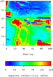
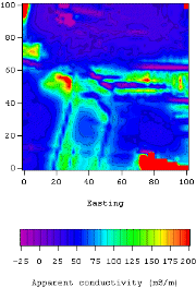
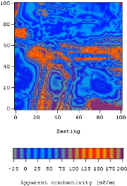
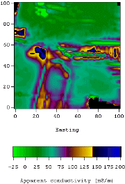
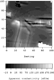
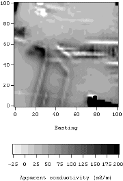
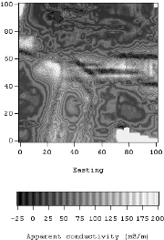
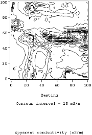
| Many issues affect a viewer's impression of what a data set is saying. Examples include the choice of colours, the scale's minimum and maximum range, the addition of contour lines as well as colours, etc. The objective when plotting scientific or technical data is to display information with as little bias as possible. Since each data set has different characteristics it is important to experiment with the visualization in order to determine which image best presents the essential aspects of the data set. Here are eight different ways of colouring a contour map of EM-31 apparent conductivity data gathered over a site with a complicated industrial history. The ground contains all manner of industrial waste, including wood waste, concrete - some with rebar, old oil tanks, railways lines, and other debris. As an example of considerations to bare in mind, in the first image there is reasonable detail visible between 70m and 100m north, where apparent conductivities are around 25 mS/m. However all the highest apparent conductivities are red, so details above 100 mS/m are obscured. The second figure shows these features at high values in more detail but structures around 25 mS/m are harder to discern. All eight methods of plotting this data set are shown in thumbnail images here, for more direct comparison of the overall effect of each colouring scheme.
|