|
 This
page is an introduction to many of the subjects related to presenting
large magnetic field data sets. Raw data are not usually presented directly.
Choices of contour plotting parameters must be made; features not related
to targets might be removed; and data or image enhancement processing
might be employed. Here we introduce some aspects of these topics. This
page is an introduction to many of the subjects related to presenting
large magnetic field data sets. Raw data are not usually presented directly.
Choices of contour plotting parameters must be made; features not related
to targets might be removed; and data or image enhancement processing
might be employed. Here we introduce some aspects of these topics.
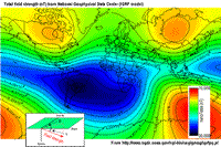
The most common form of magnetic survey data involves "total field" measurements.
This means that the field's magnitude along the direction of
the earth's field is measured at every location. To the right is a total
field strength map for the whole world (a full size version is in
the  sidebar mentioned
in the Earth's field section). sidebar mentioned
in the Earth's field section).
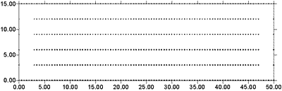
At the scale of most exploration or engineering surveys, a map of total
field data gathered over ground with no buried susceptible material would
appear flat. However, if there are rocks or objects that are magnetic
(susceptible) then the secondary magnetic field induced within those
features will be superimposed upon the Earth's own field. The result
would be a change in total field strength that can be plotted as a map.
A small scale example is given here:
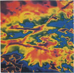
 Large
data sets are commonly gathered using airborne instruments. They may
involve 105 to 106 data points to show magnetic
variations over many square kilometres. An example of a large airborne
data set is shown to the right, with a larger version, including alternative
colour scale schemes, shown in a sidebar. Large
data sets are commonly gathered using airborne instruments. They may
involve 105 to 106 data points to show magnetic
variations over many square kilometres. An example of a large airborne
data set is shown to the right, with a larger version, including alternative
colour scale schemes, shown in a sidebar.
Such data sets will be too large to invert directly, but they can provide
extremely valuable information about geology and structure, especially
if some processing is applied to enhance desirable features and/or suppress
noise or unwanted features.
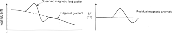
Removal of regional trends
In order to interpret the magnetic data in terms of magnetic features
and structures at depth, the anomalous field caused by buried
features of interest must be isolated. In other words, we must try to
remove the contribution to measurements consisting of the earth's field
combined with fields due to geologic features larger than the actual
survey area. This is accomplished by estimating and subtracting the regional,
or large scale field. If we designate magnetic fields as B,
then
Banomalous = Bmeasured - Bregional .
Estimates of the regional field may be obtained from:
- the IGRF (International Geomagnetic Reference Field) discussed in the next section;
- a constant value selected by the interpreter (when survey areas
are small);
- a more sophisticated polynomial (map) generated by a computer using
least squares (or other) analysis of data;
- it is also possible to use inversion at a large scale to define a
regional field.
To illustrate the process, when data are collected along a line, the
removal of a regional trend can be managed graphically, as shown here:
For magnetic maps (data collected over an area) the choice of a regional
trend may not be particularly easy, but it is critical to get it right if a
correct interpretation of subsurface distribution of susceptibility is
to be obtained. Here is an example showing the regional magnetic map
and a local anomalous field taken from a survey in central British Columbia.
 Processing options Processing options
 There
are numerous options for processing potential fields data in general,
and magnetics data specifically. One example (figure shown here) is provided
in a sidebar.
The processing was applied in this case in order to emphasize geologic
structural trends. There
are numerous options for processing potential fields data in general,
and magnetics data specifically. One example (figure shown here) is provided
in a sidebar.
The processing was applied in this case in order to emphasize geologic
structural trends.
Some other good reasons for applying potential fields data processing
techniques are listed as follows:
- Upward continuation is commonly used to remove the effects of very
nearby (or shallow) susceptible material.
- Second vertical derivative of total field anomaly is sometimes used
to emphasize the edges of anomalous zones.
- Reduction to the pole rotates the data set so that it appears as
if the geology existed at the north magnetic pole. This removes the
asymmetry associated with mid-latitude anomalies.
- Calculating the pseudo-gravity anomaly converts the magnetic
data into a form that would appear if buried sources were simply density
anomalies rather than dipolar sources.
- Horizontal gradient of pseudo-gravity anomaly: gravity
anomaly inflection points (horizontal gradient peaks) align with vertical
body boundaries; therefore, mapping peaks of horizontal gradient of
pseudo-gravity can help map geologic contacts.
The effects of these five processing options are illustrated
in a separate sidebar on
processing of magnetics data.
|