ATSC 113 Weather for Sailing, Flying & Snow Sports
Identifying Fronts
Learning goal 5f. Identify the location of cold and warm fronts using multiple weather maps.
In Learning Goal 5g we saw how cold fronts can have a big impact on your ski day (as do warm fronts, covered in Learning Goal 5h), so you want to be able to identify them on real-world weather maps to plan for your upcoming ski trip.
As a reminder, a cold front indicates the boundary between relatively warmer and colder air masses, where the colder air is advancing. A warm front indicates the boundary between a warm and a cooler air mass, where the warm air is advancing. The front itself is not a precise boundary, but rather a transition zone. This zone is called a frontal zone. A frontal zone is defined by a relatively strong horizontal temperature gradient.
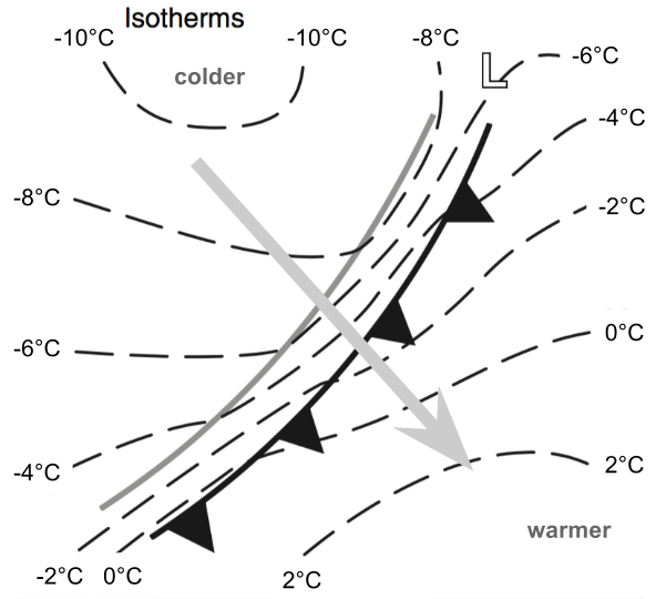
Fig. 5f.1a. An idealized cold front. The dashed lines are isotherms. The grey arrow indicates the direction of the front's movement. The frontal zone is the region between the cold front (line with black triangles) and the grey line. Note the relatively strong temperature gradient within the frontal zone. (Credit: Stull)
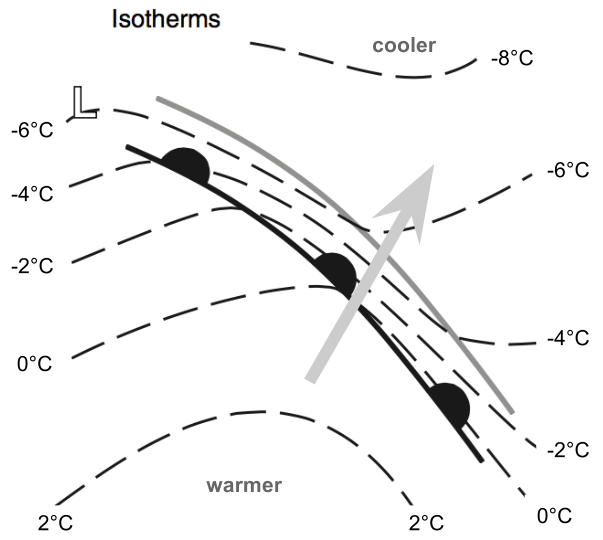
Fig. 5f.1b. An idealized warm front. As for the cold front, the dashed lines are isotherms, and the grey arrow indicates the direction of the front's movement. The frontal zone is the region between the warm front (line with black semicircles) and the grey line. Note the relatively strong temperature gradient within the frontal zone. (Credit: Stull)
There are secondary indicators of a frontal zone, like a change in wind direction from ahead of the front to behind it (called a wind shift), a pressure trough, and often higher relative humidity. We will talk about how to identify such features below. The following colourful forecast maps are created from output from numerical weather prediction (NWP) models.
Surface maps
As we've seen in other maps, real-world versions are more complicated and messy than what you see in Fig. 5f.1. Here's a surface air temperature map (defined at 2 metres above ground level):
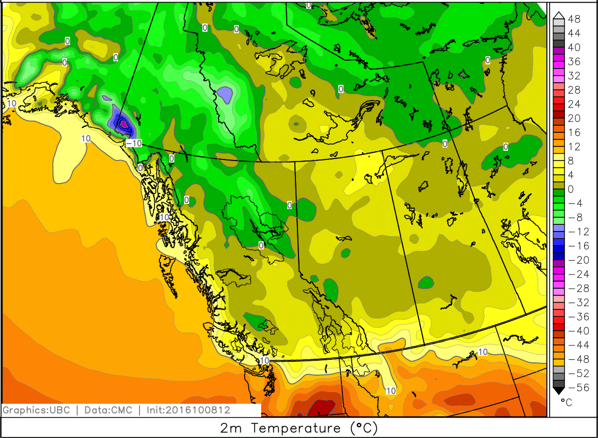
Fig. 5f.2. Air temperature (2 metres above ground level), shaded every 2°C according to scale. (Credit: West)
In the above figure, you can see a temperature gradient (isotherms are close together) just south and north of the Canada/USA border. This is a frontal zone. You can see some other gradients on the map too, namely over the northern Canadian Rockies in northern BC. You might also notice that the frontal zone near the border has some weird squiggles in it where it passes over the Rockies.
Temperatures typically decrease rapidly with height (inversions aside). When you're looking at surface air temperatures in complex terrain, they can vary greatly, making it difficult or impossible to pick out a frontal zone.
When looking at temperatures on a higher-resolution NWP model that better represents the true terrain, the frontal zone gets harder to discern. If we look at a much higher-resolution model from the same time, over the Vancouver/Victoria area, we see mostly just temperature gradients resulting from terrain height differences, and the front is impossible to see.
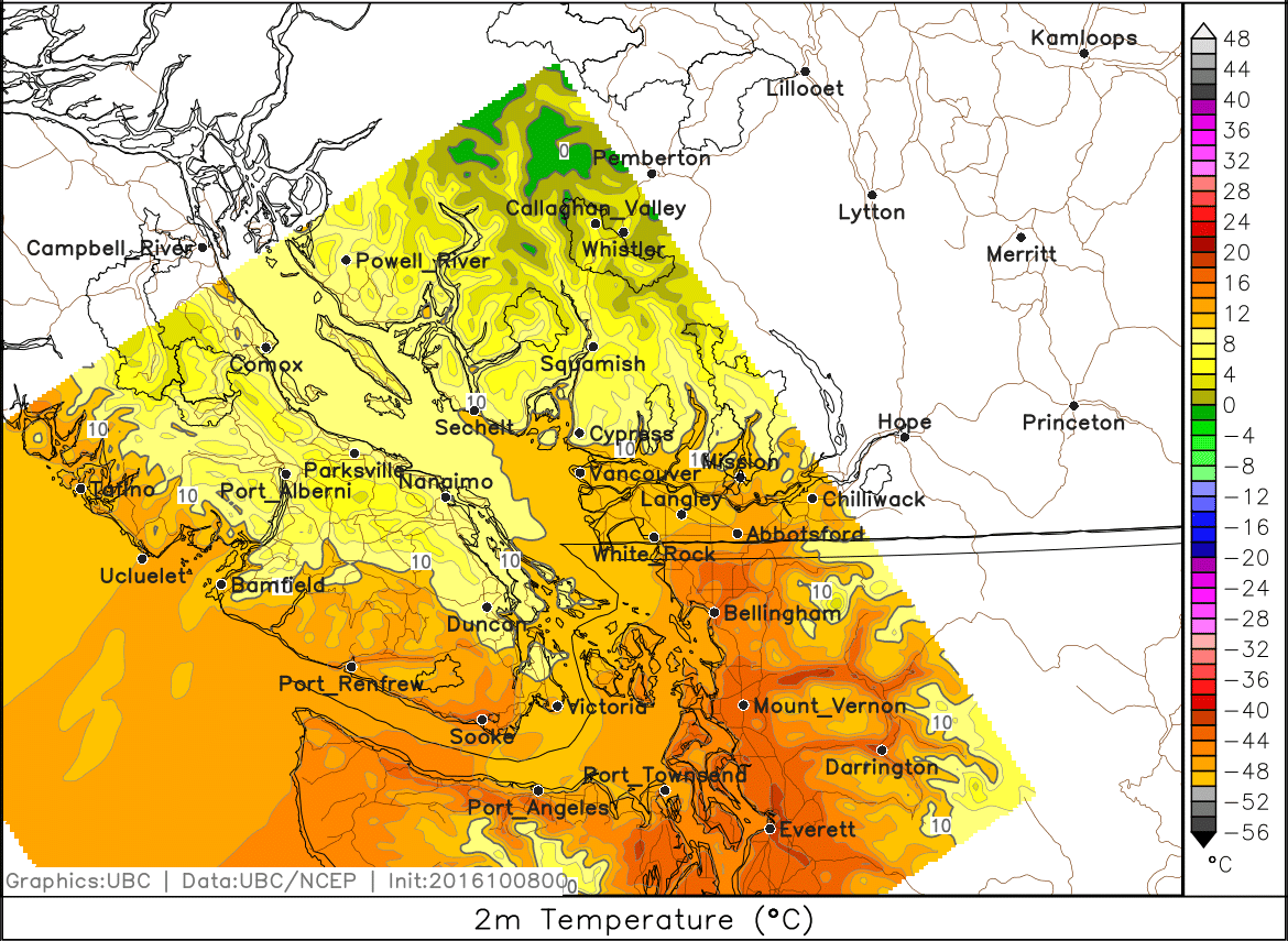
Fig. 5f.3 - A surface air temperature plot from a very high-resolution NWP model. Most of the temperature gradients are due to temperature changes with height. (Credit: West)
Thus, while surface air temperature maps can be useful for picking out fronts, it's sometimes better to look above the surface at pressure-level maps.
Pressure-level maps
Pressure-level maps allow you to look at temperatures at a pressure levels that are located above terrain effects. Let's look at an 85.0-kPa pressure-level map for the same time as the air temperature:
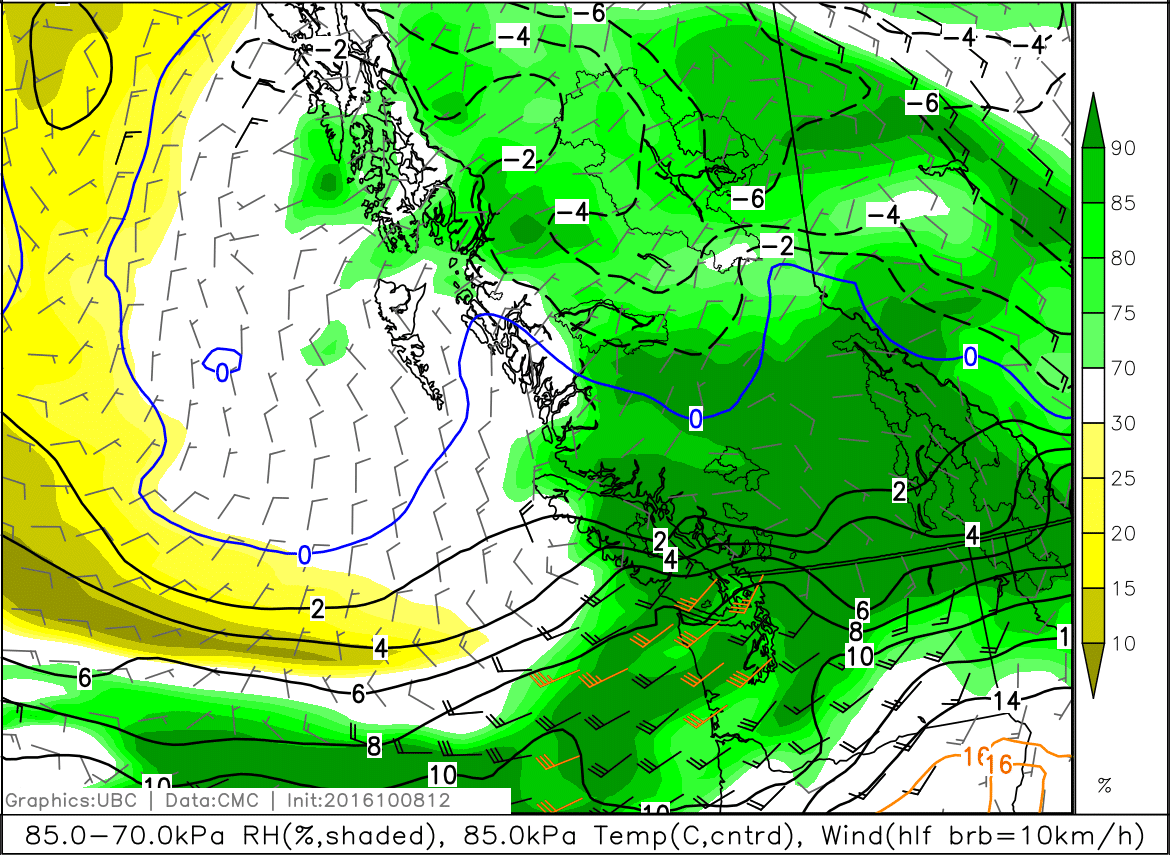
Fig. 5f.5 - An 85.0-kPa pressure-level map, similar to those you've seen in previous learning goals. Isotherms are the solid and dashed lines. (Credit: West)
Note the temperature gradient (where contours are packed relatively close together) that is present along the Canada/USA border. It's much easier to see gradient on this map as compared to the surface maps. Recall that the vertical cross section of a front does not go directly vertically upwards, so the front at the surface will be in a slightly different location than the front at the 85.0-kPa level. However, this still tells you the approximate location well enough.
This particular case was a stationary front since neither air mass was advancing. Cold and warm fronts look similar on maps. The best way to tell if it is a cold, warm, or stationary front is to look at a series, or animation, of maps, and determine if the cold or warm air mass is advancing, or neither.
Secondary indicators
Aside from temperature, some secondary indicators of cold fronts include wind and moisture. In the Northern Hemisphere midlatitudes, the winds ahead of a cold front typically come from the southeast, south, or southwest. Behind the cold front, winds are typically from the west or northwest (Fig. 5f.6a).
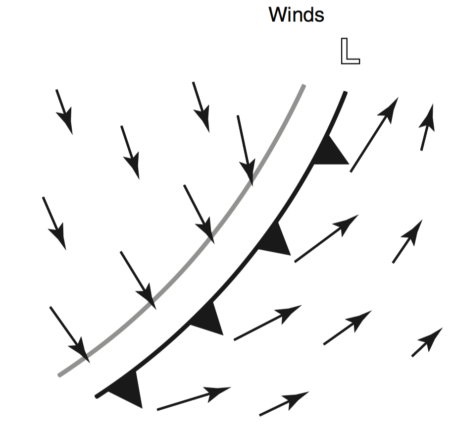
Fig.5f.6a - Idealized view of the wind shift at a cold front. (Credit: Stull)
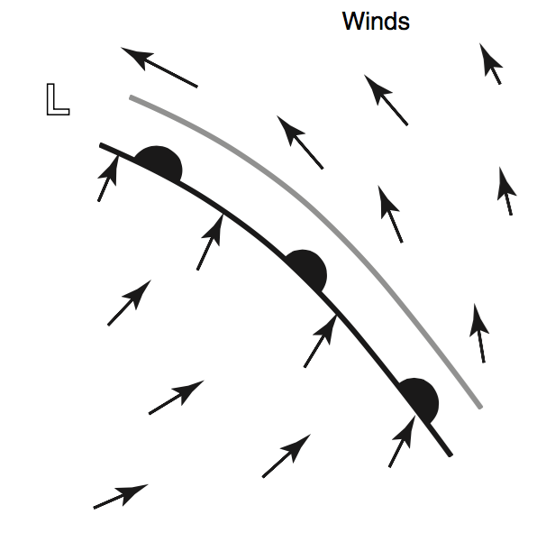
Fig.5f.6b - Idealized view of the wind shift at a warm front. (Credit: Stull)
Different regions see different wind shifts. Here at the South Coast of BC, winds ahead of cold fronts are typically southeasterly, and winds behind cold fronts are typically southwesterly. You can see this on the forecast map in Fig. 5f.7. This could potentially be confusing given the idealized winds for a warm front (Fig. 5f.6b), which is why we use wind as a secondary indicator.
The important take-away point is that wind direction typically changes across a front, and this is known as a wind shift. In addition,
topography often channels winds in a different direction than they
would otherwise be travelling in, but we'll get into that more later (Learning Goal 6m).
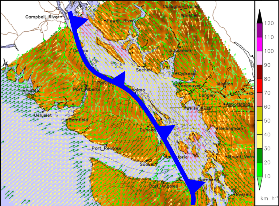
Fig. 5f.7 - Forecasted winds near a cold front moving through the south BC coast in March 2016. On this map wind speeds vary by colour according to the scale at right. Other wind maps may use wind barbs (covered in Learning Goal 5b). (Credit: West)
Looking back to pressure level maps in Fig. 5f.5, notice the wind shift along the frontal zone (above the surface). Also, note the higher relative humidity values along the front. Frontal zones are regions of convergence and lift, which, in the presence of moisture, leads to cloud formation (condensation) and precipitation. On a pressure level map, relative humidity values are typically higher along a front. There is often a band of precipitation present along a front as well, which would be visible on a precipitation forecast map.
Keywords: frontal zone, numerical weather prediction (NWP), surface analysis map, stationary front
Figure Credits
Howard: Rosie Howard
West: Greg West
Stull: Roland Stull
COMET/UCAR: The source of this material is the COMET® Website at
http://meted.ucar.edu/ of the University Corporation for Atmospheric
Research (UCAR), sponsored in part through cooperative agreement(s)
with the National Oceanic and Atmospheric Administration (NOAA), U.S.
Department of Commerce (DOC). ©1997-2016 University Corporation for
Atmospheric Research. All Rights Reserved.