Tips to help you earn higher grades, as recommended by our TA Davi Monticelli.
Excel is (argueably) long behind common coding languages such as R or Python when it comes to plots. Nevertheless, the benefits of a spreadsheet interface and easiness of manipulating data makes it preferable when handling routine reports.
Seeing many students in this class opt to use Excel, I am writing a personal guide on making plots "look better" for future reference. Use it as you please :)
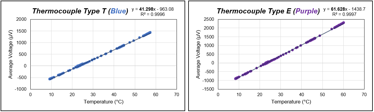
This is an example from the Thermocouple lab (Lab 2). See the figures below.
Highlight the title: Bold + Italics usually turns out good
Use colour coding: wire (or piece used) was blue/purple? Let the reader know right away! Use the title and data points colour as hint
Display the equation in the top corner. Only display inside the chart if you are putting a box around it (black outline/blank background preferably)
Highlight the most important piece of the equation (in our case, the slope of the curve)
Regarding the curve, don't use dashed lines as they can be mistaken with your data points, solid lines are preferable. You can change the transparency to 50% for a nice blending
Titles do not necessarily need to be Variable Y vs. Variable X, be creative :) Usually, they convey the main message of the plot (in our case, the thermocouple type)
Borders: now, this is tricky. For reports, usually, a bold border outside and a light border inside works (see below). But sometimes it is good to have no borders at all (contrary to a grey line - default)
Units: always use symbols for "microvolts" or "degrees C" for instance. They will match what you type in the text
R-value: good to reaffirm that your linearization fits the data
I always prefer to have the axis values next to the axis (instead of the middle of the plot)
Organize everything space-wise to be aesthetically pleasing, and use the same font type as the report, or at least the same font type in all the plot
The font size of the axis numbers and axis labels should be large enough to be roughly the same size as the font-size in the rest of your lab report.
This is the content for Layout Figure TagFig. 1. Good examples of graphs from Excel. Source: Davi Monticelli, 2023.