ATSC 113 Weather for Sailing, Flying & Snow Sports
Interpreting Temperature from Pressure-Level Maps
Learning Goal 5a. Interpret temperatures from pressure-level maps.
Pressure-level maps are introduced in Learning
Goal 5b.
We use temperature forecasts to dress appropriately for skiing, whether precipitation will fall as rain or snow, and to identify fronts (Learning Goal 5f). Here we will discuss some ways to look at temperatures for your ski day.
Reading Temperatures
Let's start with an 85.0-kPa (~1500 m) pressure-level map of temperature:
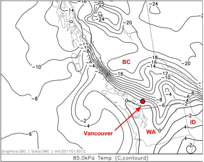
Fig. 5a.1 - An 85.0-kPa pressure-level temperature map covering the northeast Pacific Ocean, BC, Washington, and some of Alberta. The contours show temperature (every 2°C); the dashed lines indicate temperatures below 0°C. The location of Grouse Mountain is shown with a red dot. (Credit: West.)
The black contours in Fig. 5a.1 show lines of constant temperature, i.e. they connect points that have the same temperature. Contours are every 2°C. On this map, the 0°C contour is near the BC South Coast. Just north of this is the -2°C contour, which runs over Grouse Mountain (red dot). The label for the 0°C contour is fairly easy to find between Vancouver Island and the mainland (and another over central Washington, USA [WA]). The -2°C contour is more difficult, but if you follow the dashed contour up along the BC Coast to the North Coast you'll see it (and another in the northern tip of the Idaho, USA [ID] Panhandle).
At Grouse Mountain, the model temperature forecast of -2°C at this altitude (~1500 m, ~250 m above the top of Grouse Mountain) provides a first guess of the temperature we would expect at Grouse at this forecast time. This is a typical winter temperature for the North Shore Mountains. You will learn how to further refine your temperature forecast in Learning Goals 6h and 6i, as well as how to take into account moisture (Learning Goal 5c).
Recommended - watch the two videos below to help you understand how to read contours on a map:
We've already learned about wind (Learning Goal 5b), so let's combine the two fields:
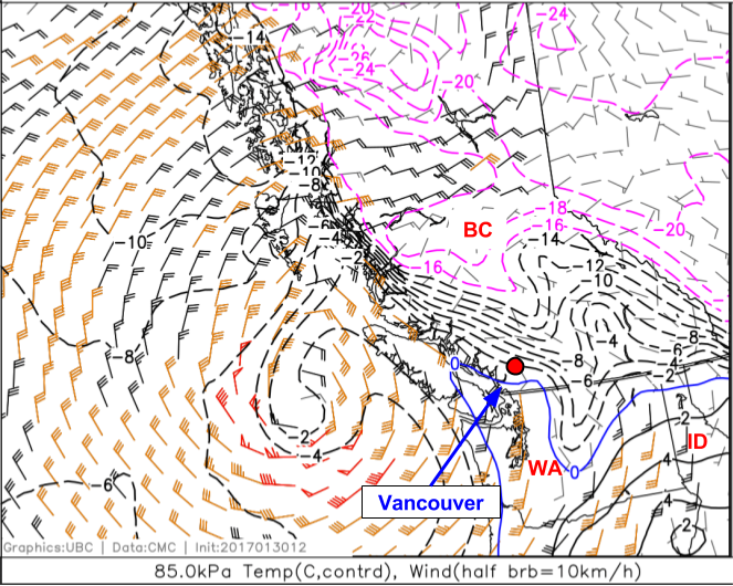
Fig. 5a.2 - An 85.0-kPa pressure-level temperature and wind map covering the northeast Pacific Ocean, BC, Washington, and some of Alberta. Temperature and wind contours are coloured to highlight important values. For example, the 0°C temperature contour is blue to highlight the division between above and below freezing temperatures; as wind speeds increase, the colour of the wind barbs goes from black to orange to red. The location of Grouse Mountain is shown with a red dot. (Credit: West.)
Based on what we've learned about interpreting winds from pressure-level maps (Learning Goal 5b), a strong, counter-clockwise wind field is apparent just west of Vancouver Island. You may correctly infer that this is a strong low pressure system. 85.0-kPa (1500-m) winds in excess of 100 km/h are visible on the south side of the low, with strong winds immediately south and west of Grouse. So, although temperatures at Grouse Mountain look fairly benign, the approaching strong low pressure system, and associated intense wind field, should alert you to hazardous ski conditions.
Keywords: pressure-level map, analysis map, forecast map
Figure Credits: Stull: Roland Stull, West: Greg West, Howard: Rosie Howard